Publisher’s Headquarters
The end of a lease on Dutch educational publisher Noordhoff’s existing headquarters building provides an exciting opportunity to consider the redevelopment of one of the company’s former distribution warehouses into a new, updated head office. What approach could transform these existing storage halls into an attractive working environment which appropriately represents the company? What design can contribute to the company’s efficiency as well as its working culture?
- Location
- Groningen, Netherlands
- Status
- Competition
- Year
- 2014–2014
- Client
- Noordhoff Uitgevers, Groningen, Netherlands
- Programmes
- Offices
- Themes
- Architecture, Transformations
The end of a lease on Dutch educational publisher Noordhoff’s existing headquarters building provides an exciting opportunity to consider the redevelopment of one of the company’s former distribution warehouses into a new, updated head office. What approach could transform these existing storage halls into an attractive working environment which appropriately represents the company? What design can contribute to the company’s efficiency as well as its working culture?
The old distribution center consists of a series of interconnected buildings, which developed in phases. A high-ceilinged storage hall, a two-storey office wing, an older low-rise storage space, a loading bay for trucks and a silo for the sprinkler system.
How to convert this into an effective, well-designed building which the publisher’s employees can be proud of? The original storage space, the great hall, has by far the most spatial and structural potential of all the buildings. Its skin is well insulated, it is in good condition generally, and its floor can withstand significant loads due to its original use as a warehouse.
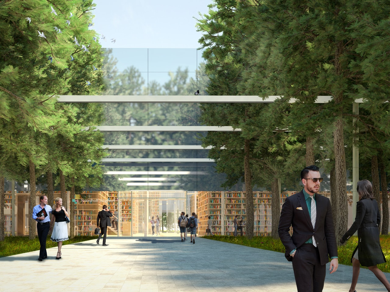
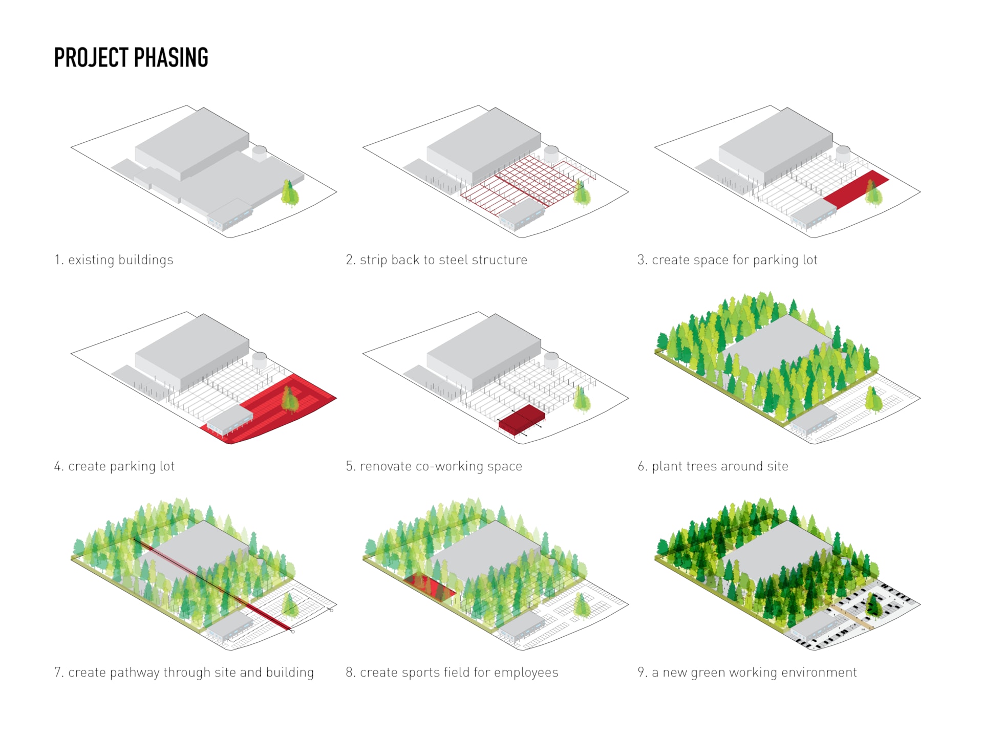
The required program of offices seems to fit well into this grand space, offering many exciting spatial opporunities. By concentrating the required program in this single volume, the rest of the land and buildings can become a park. The remnants of the other structures are stripped back to create a kind of contemporary Pompei… A garden set within ruins, with picturesque steel beams running amongst the trees, forming paths. Parking is concentrated on the side of the site accessed by road. The two story office block can function as a temporary work space for meetings, exhibitions and events, and appears to float above the parking lot when its ground floor is stripped back to the steel columns.
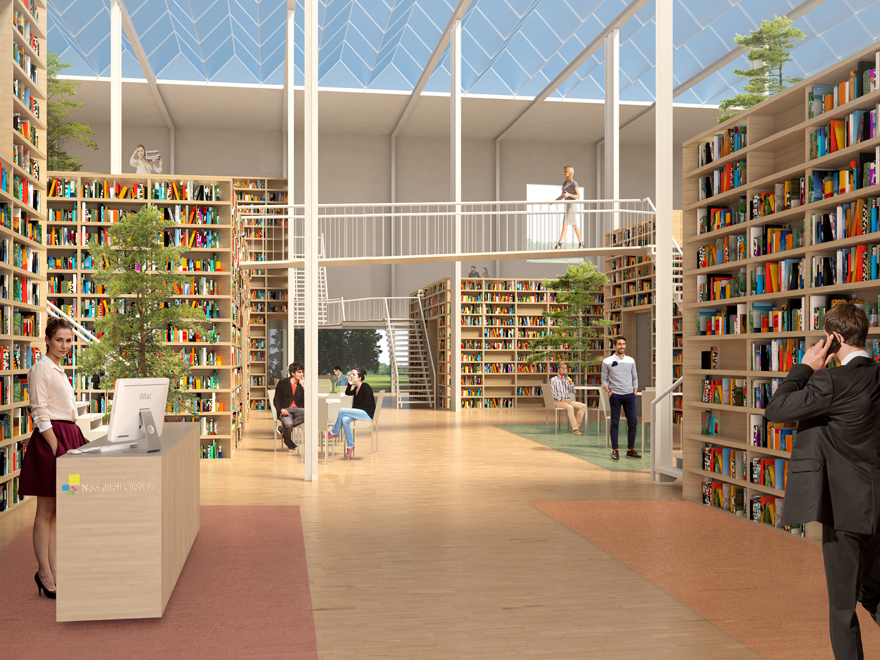
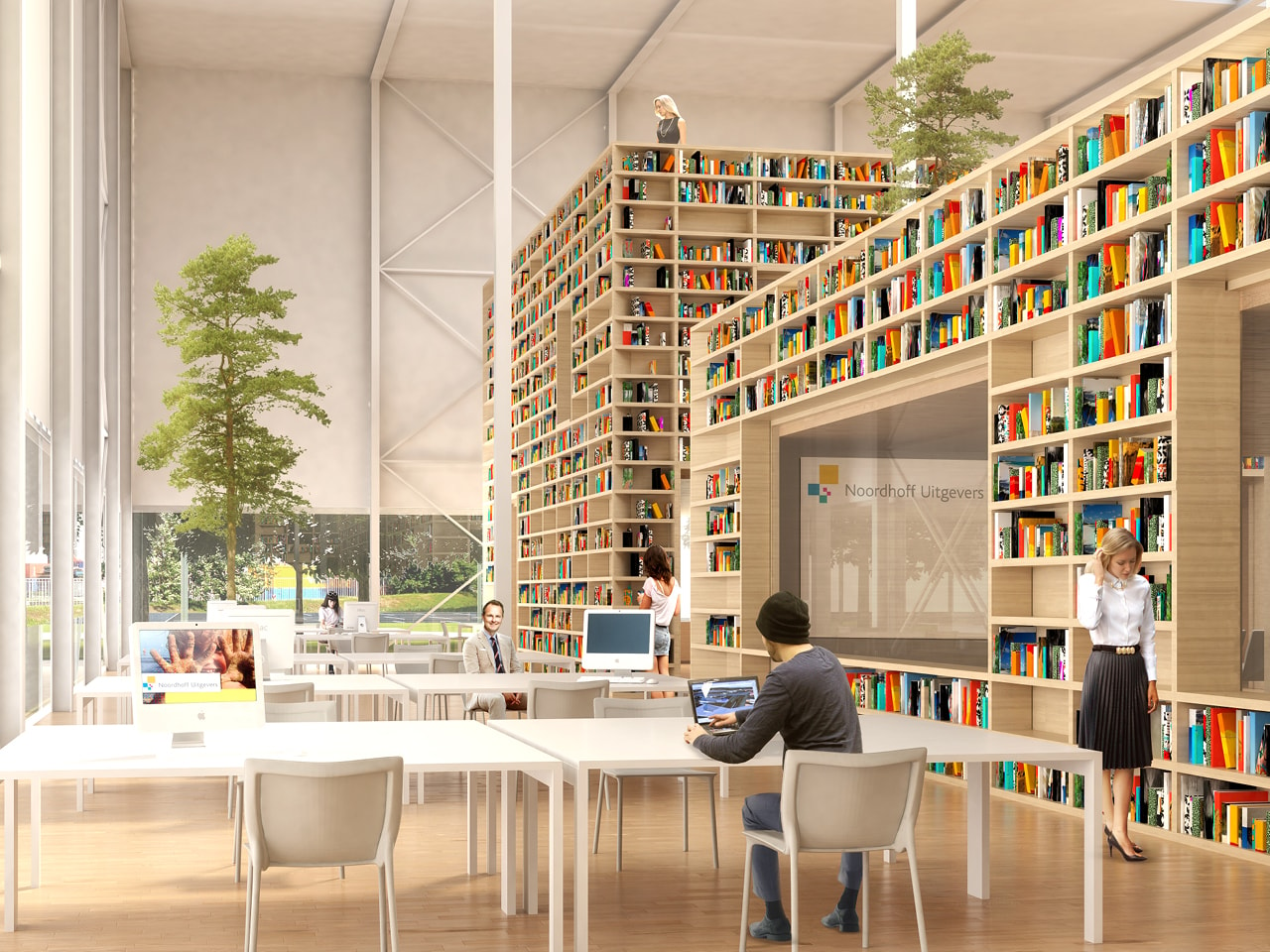
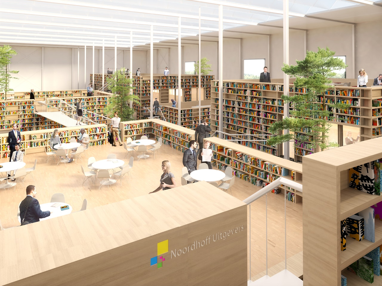
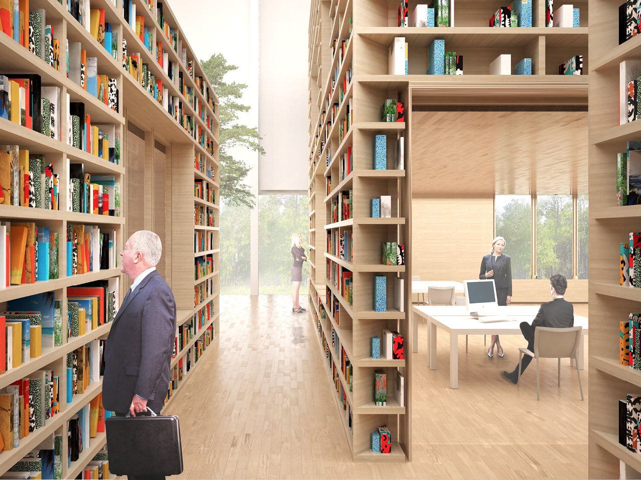
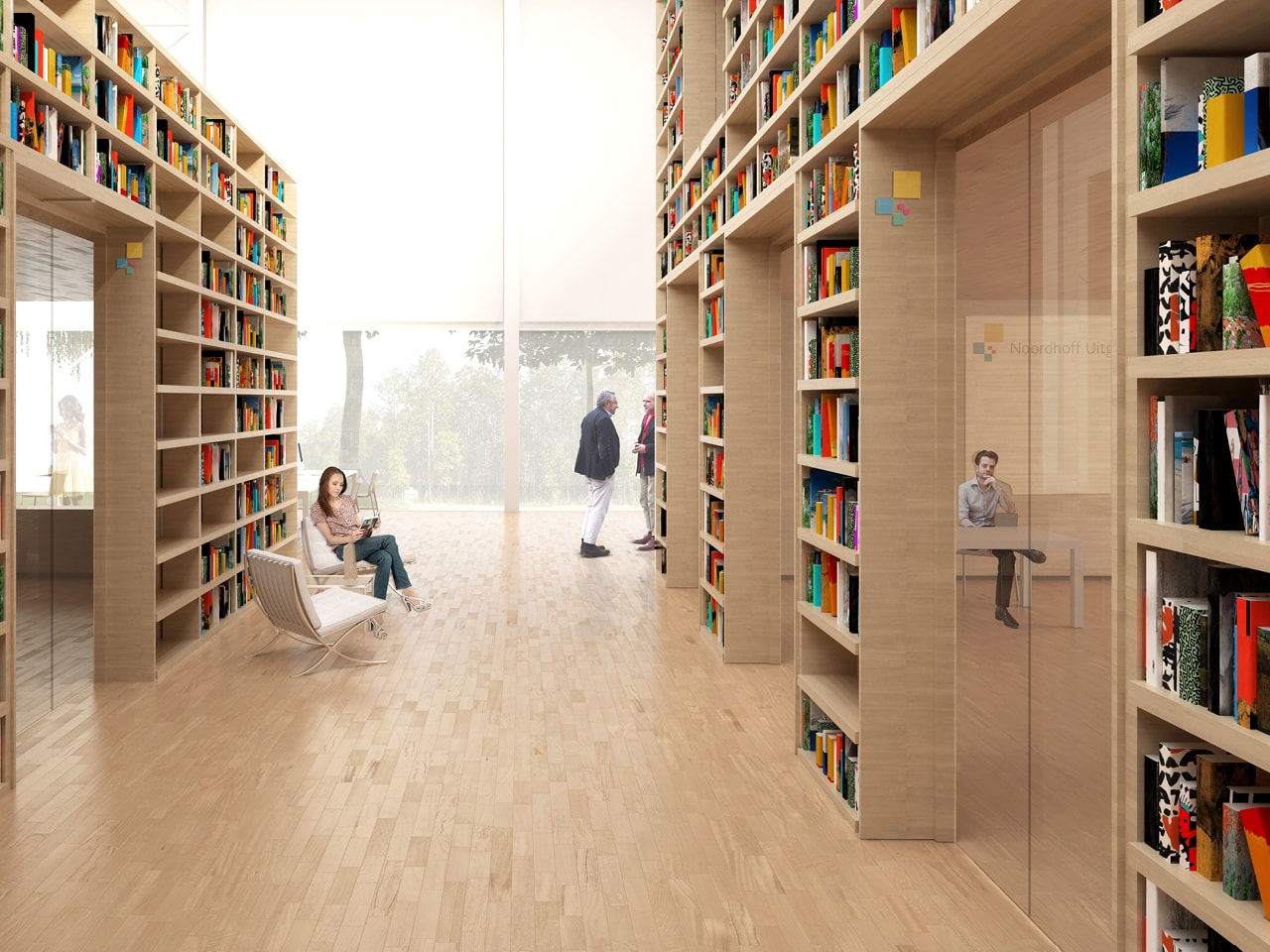
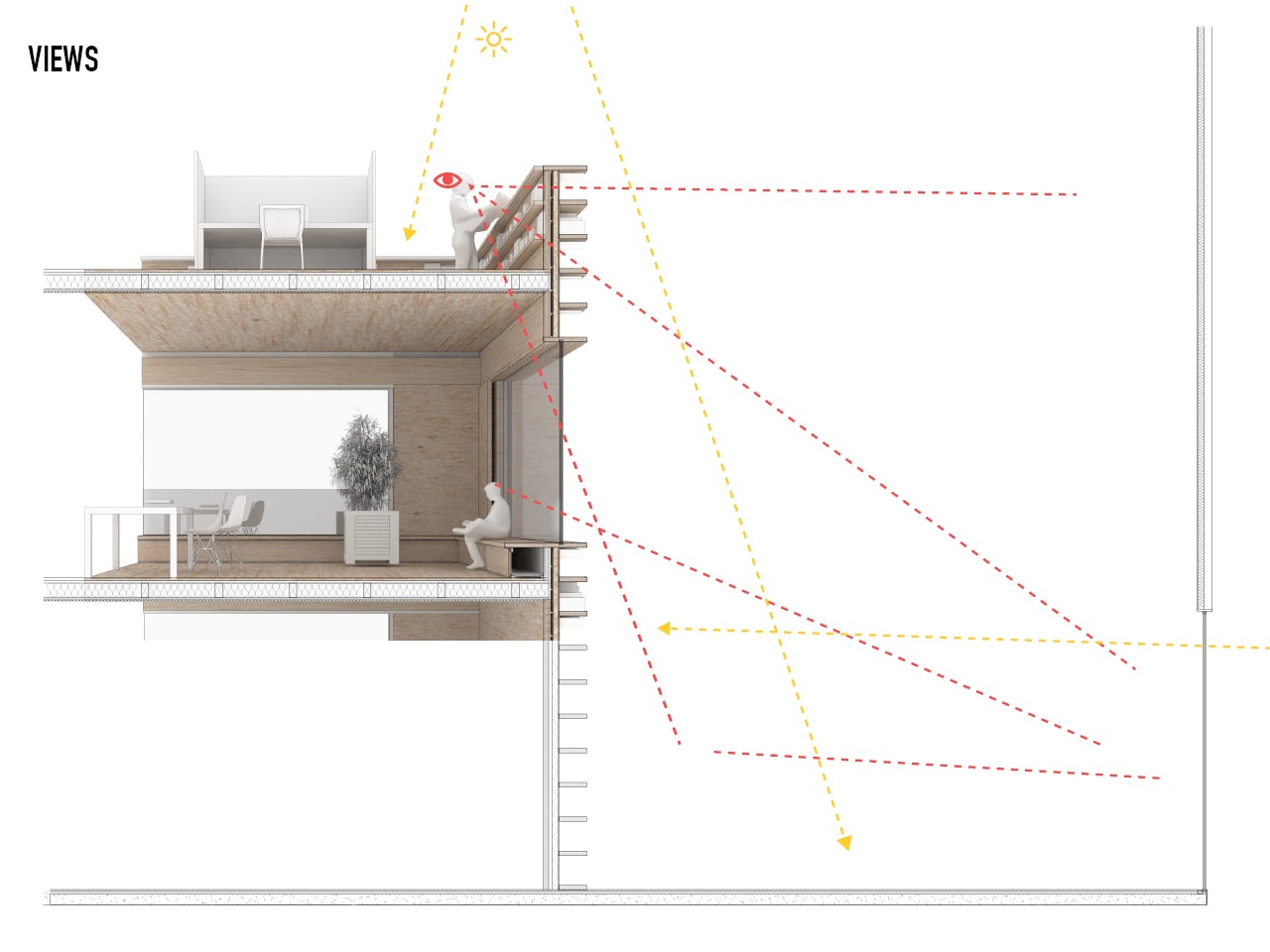
A wide central path leads through the woods to the entrance of the hall. The path continues into the building, acting a main street with the entrance desk, café, library and entrances to meeting rooms all arranged along it. The Hall is filled with programmatic boxes, some single, some double storied. A new roof of glass, like that of greenhouse, provides natural lighting throughout the hall. Programs which are more closed and private, such as kitchens, bathrooms, vertical circulation and meeting rooms are located on the ground floor of each box, while more open programs such as workspaces and informal meeting spaces can be placed around the boxes and on top of them. By creating a large panoramic window continuously around the hall, employees no longer feel like they are working on an industrial estate, but rather in a green, campus-like environment. The boxes are clad in wood, and where appropriate, can be covered in bookshelves to proudly display the collection of the publisher.
Gallery

.jpg?width=1920)
.jpg)