Shenzhen CBD
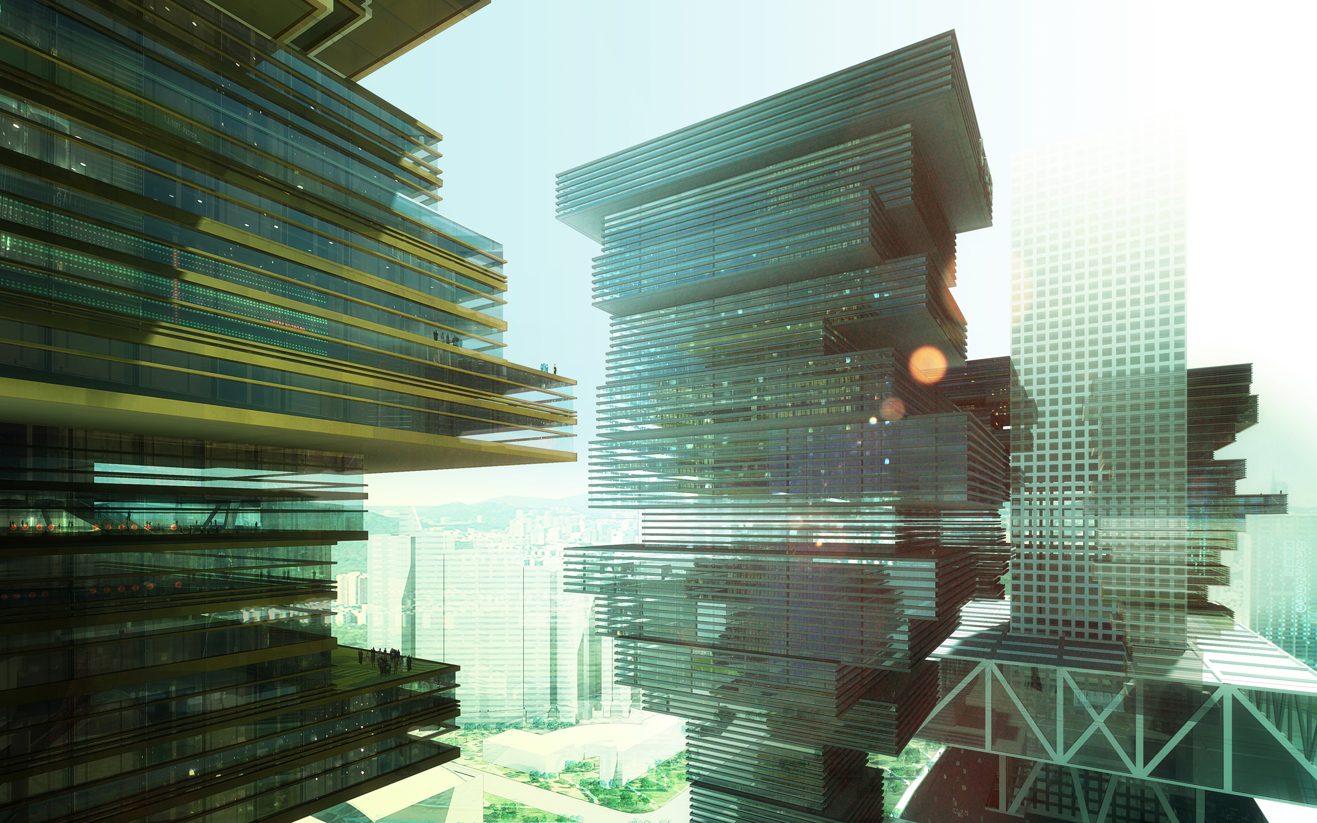
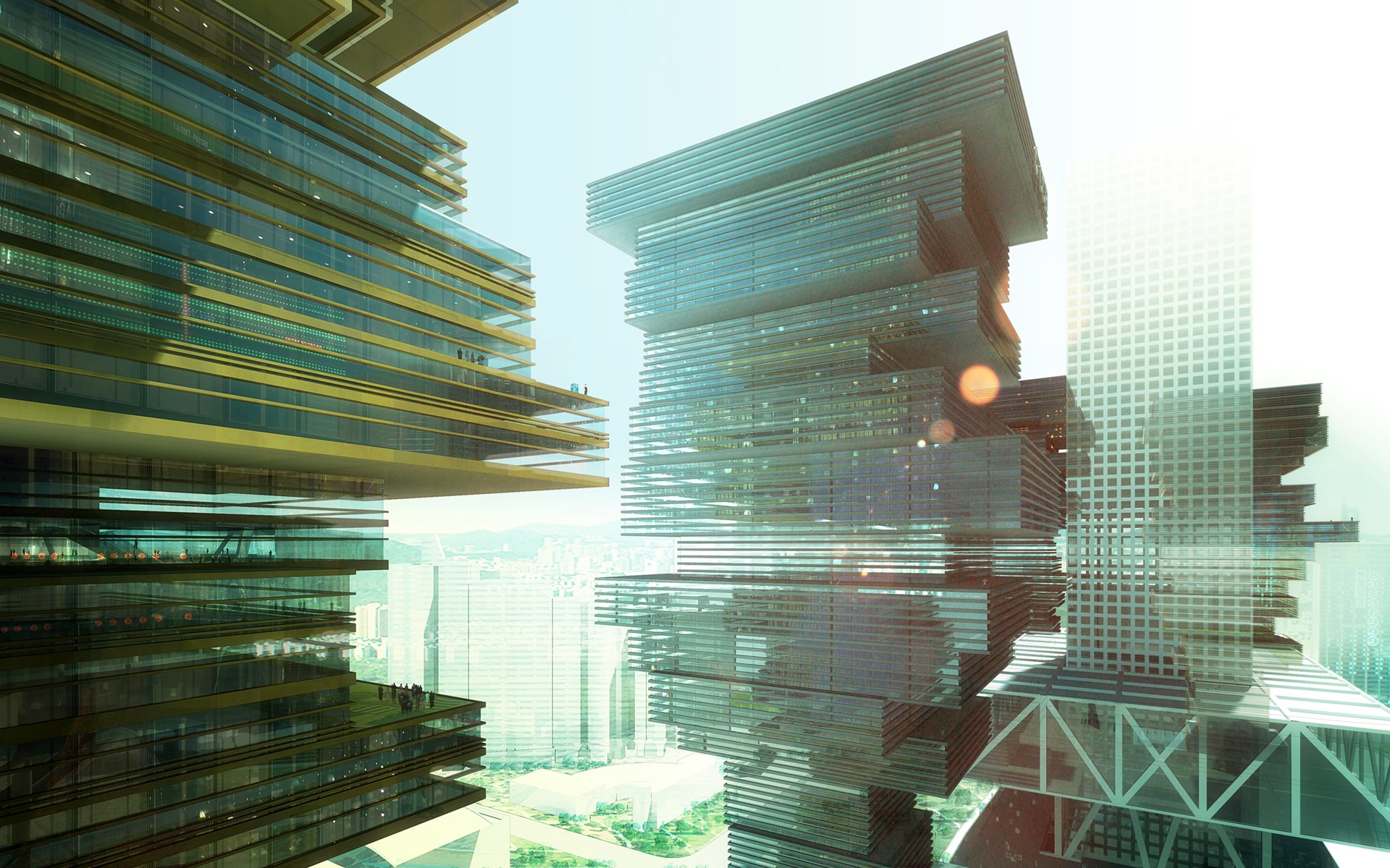
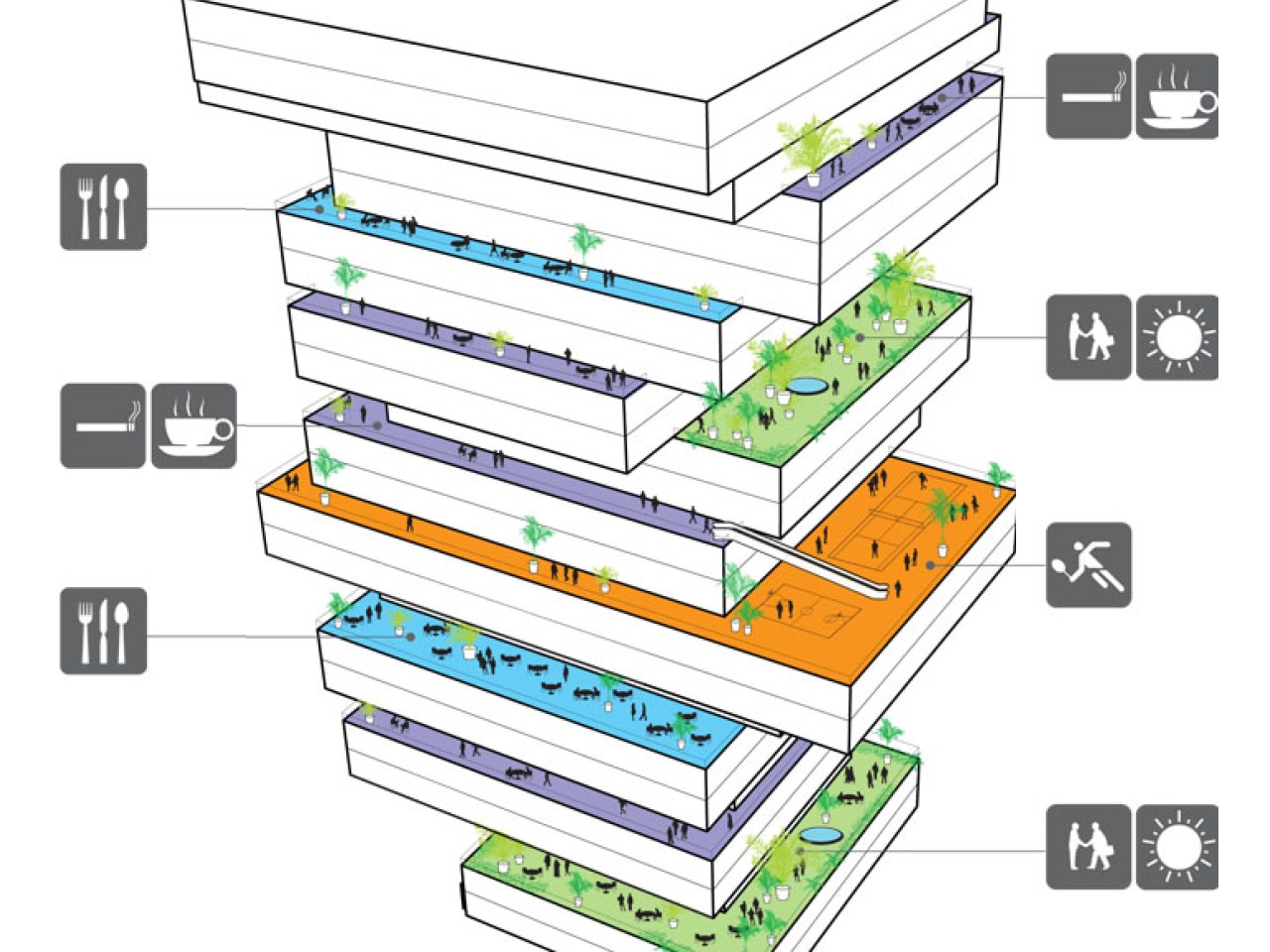
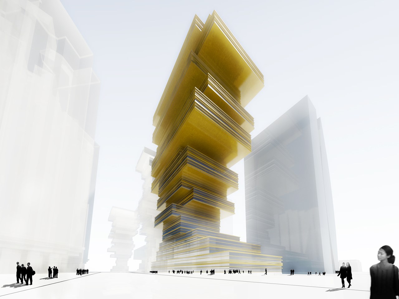
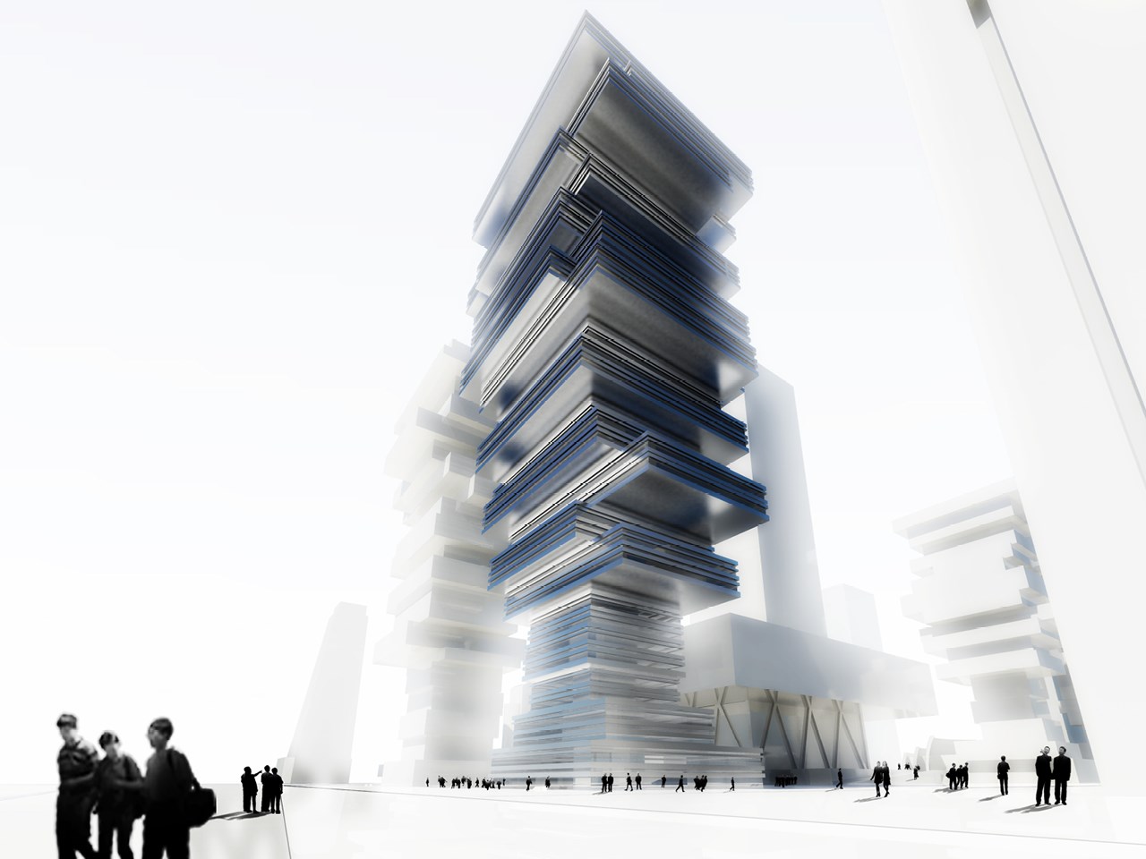
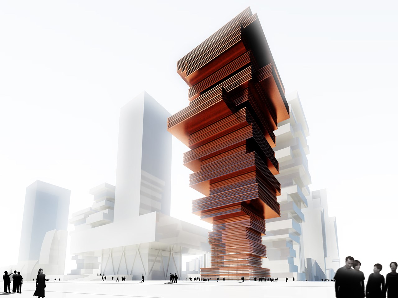
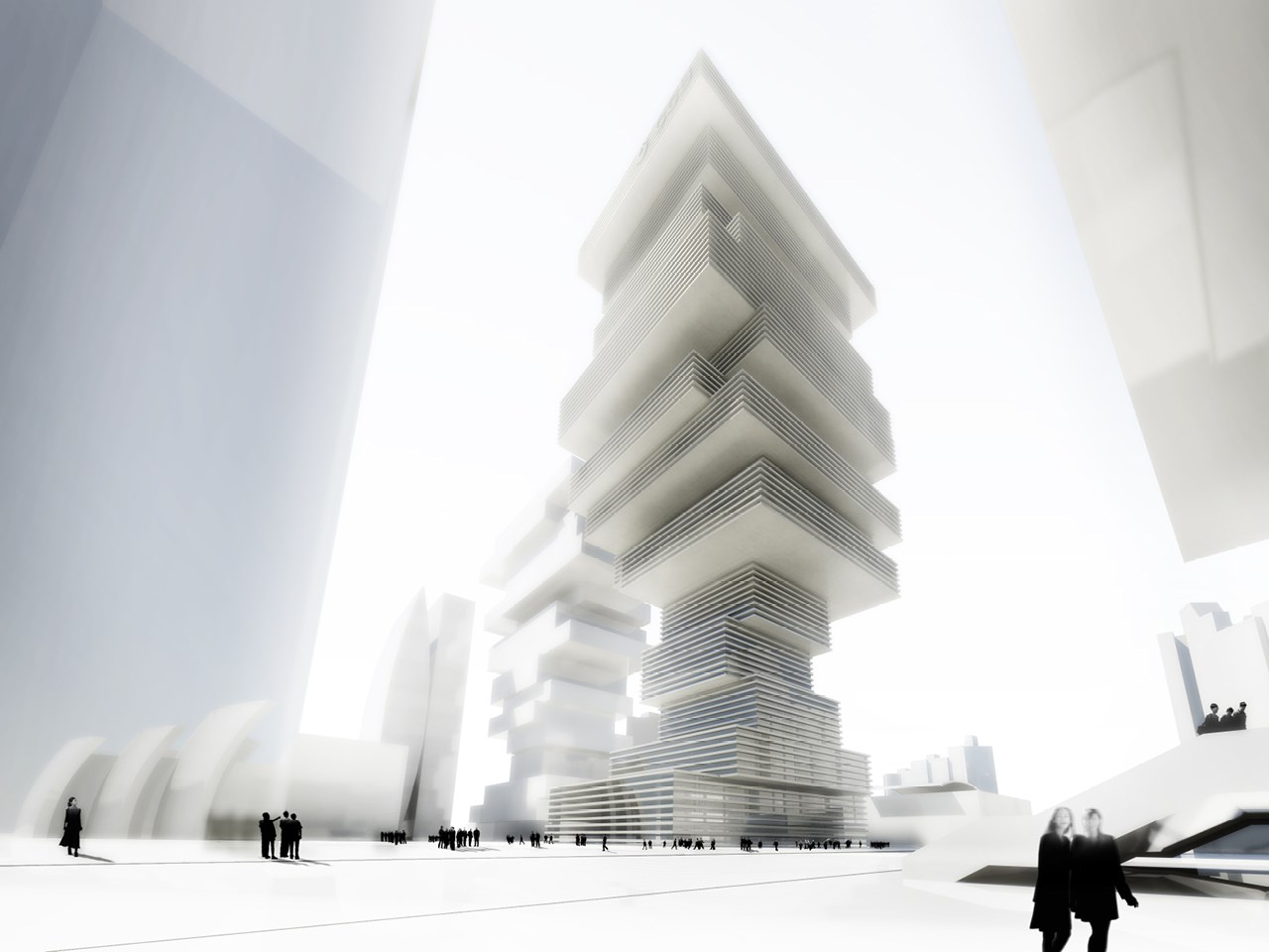
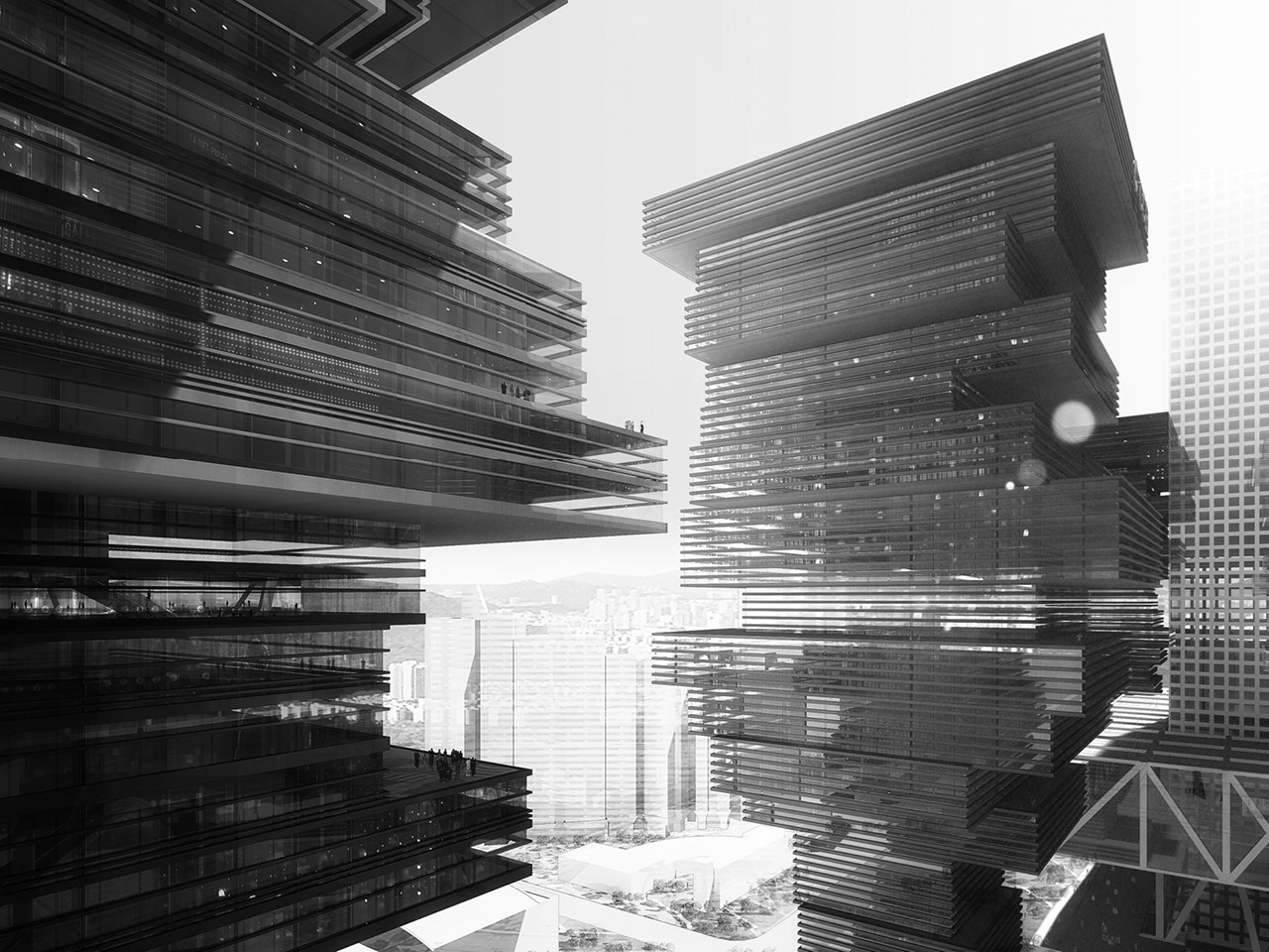
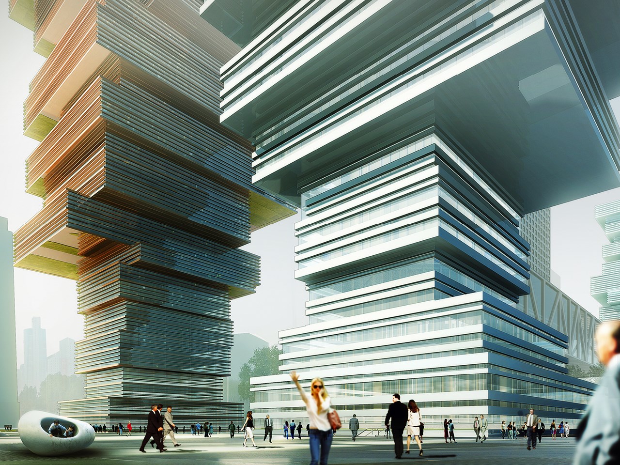
By changing the size and relationship to the core of each floor of these office towers, MVRDV created differentiated and singular office environments which are highly flexible according to the tenants needs. An individualized sequence of plateaus can be created. As a side effect, due to the different floor sizes, a series of balconies emerge, which can be used for social gatherings and for gardens in the sky, panoramically overlooking the district and the city. A ’catalogue’ of floor plans has been developed: from normal floors that surround the core evenly, via floors with a bigger floor plan on one side, via completely single oriented deeper floor plans, via U and L shaped floor plans, to floors with private wings for executive staff or meeting rooms.
- Location
- Shenzhen, China Mainland
- Status
- Competition
- Year
- 2008–2008
- Surface
- 360000 m²
- Client
- Shenzhen Planning Bureau/ Financial Development Service Office
- Themes
- Architecture
Many recent Central Business Districts (CBDs) consist of series of more or less straightforward office towers without much aesthetic coherence, each of them celebrating individuality over the collective. These developments are leading to very similar city centres.
Is this desirable? Or can we find a way to combine individuality with more collective urban qualities? Can there be a more distinguishing character, with a stronger appearance, attracting people from afar, to become outstanding over other competitors? Can the momentum of the coincidental simultaneous development of four new towers in the CBD district of Shenzhen help to develop a more coherent and more specific high quality environment?
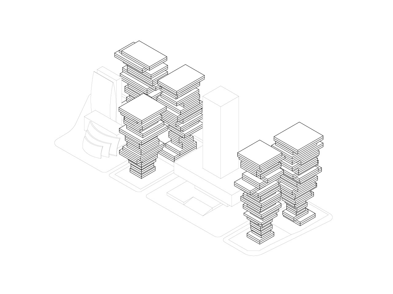
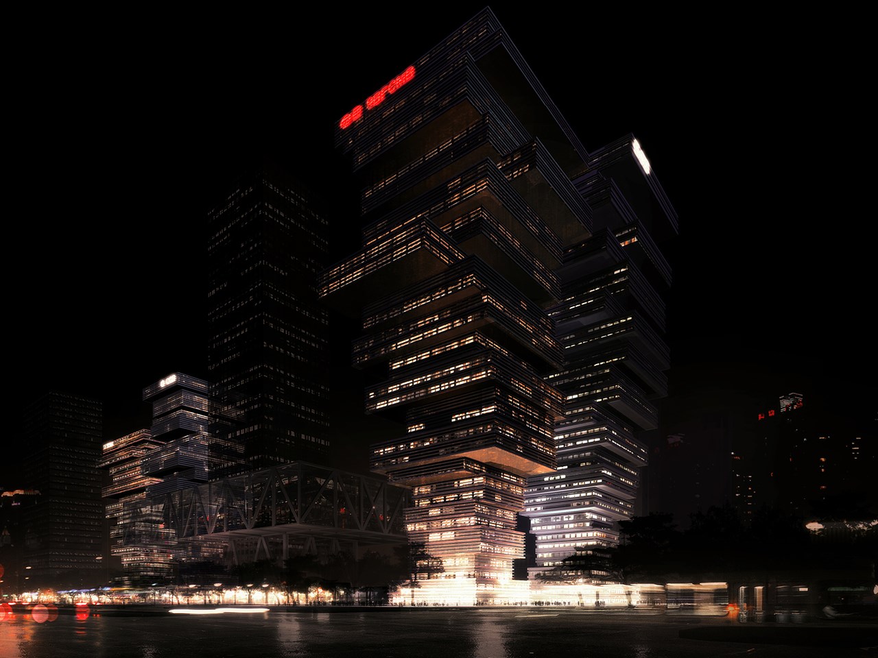
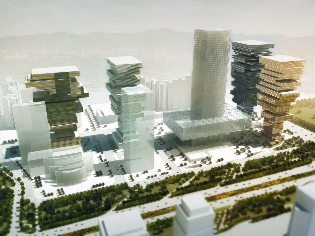
The Shenzhen CBD will undeniably be strongly dominated by the new stock exchange building with its remarkable character. The building is conceived as a tower with a lifted block holding the collective program of the trading floor. This creates not only a remarkable figure; it also creates a nice sheltered plaza. It is an object with an urban meaning. Can and should this direction not set the tone for the further development of the district? Can this suggestion be extended in the urban approach of the four new surrounding towers, so that a partly covered district appears instead of a single main building surrounded by bland characters?
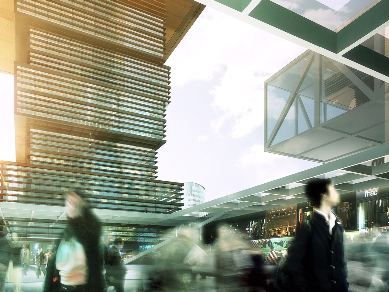
By doing this, besides the great central open area, a series of more sheltered plazas and public spaces emerge, protecting Shenzhen’s citizens from the strong sun and rain, encouraging street life and street usage. A vivid district can be imagined, sheltered by these ‘trees’.
Many of the existing office buildings in Shenzhen are conceived as simple extrusions of a basic floor plan. This leads to a high efficiency and also to generic repetition and monotony. By changing the size and relationship to the core of each floor, differentiated and singular office environments are created, adaptable to the client’s specific demands. The floors become recognizable. A more individualized sequence of plateaus can be created. As a side effect, due to the different floor sizes, a series of balconies emerge, which can be used for social gatherings and for gardens in the sky, panoramically overlooking the district and the city. The overhangs create shadow over these terraces.
A ’catalogue’ of floor plans has been developed: from normal floors that surround the core evenly, via floors with a bigger floor plan on one side, via completely single oriented deeper floor plans, via U and L shaped floor plans, to floors with private wings for executive staff or meeting rooms. The selection of the floor types can lead to different highly customized towers. Every tower is different in its composition. In this way the towers become different but related, leading to a ‘family’ of towers. The balconies can be used to position trees and other planting, and landscape features. These can be interconnected with stairs so that vertical parks emerge. Truly green buildings become possible. With the plants, the entire buildings obtain a tree like appearance. A welcoming compensation in an area that is so dominated by straight forward elements of mirrors and glass.
By reducing the size of the lower floors of each building, views are created that open up the district and allow the new Stock Exchange to become more visible and act as a point of visual orientation. It becomes the heart of the district, visible from everywhere. The reduction also leads to more open areas at ground level: plazas and wide pavements that provide attractive space for the workers to meet and to exchange. These spaces are sheltered by the overhangs above, protecting the spaces from the heat or rain. Additional trees create a comfortable climate. The area becomes a usable public outdoor space all year round. The tapering softens the somehow blunt appearance of the Shenzhen Stock Exchange tower, giving it a more nuanced, refined, and elegant environment within which to sit. The towers act as a series of ‘trees’, covering the CBD plazas and pavements.
By connecting the minus one level of the plots with the metro system with its shopping centre a great concourse emerges. Directly connected with the metro it has direct access into the lobbies. By surrounding these lobbies with retail and shops, a vivid underground street system emerges. By creating glass roofs natural light penetrates into these spaces. Escalators and lifts connect the lobby level with the street level. This family of four towers has the great potential to enrich the Shenzhen Central Business District by adding distinguished character and by becoming an attractor and facilitator to city life. Through attractive individual spaces on the inside and the many levels of vertical park on the outside the buildings are beacons of progress. This collective of individuals can communicate to the world how Shenzhen and its financial heart are world leaders of innovation.
On ground floor the buildings’ cores are surrounded with programs such as access lobbies, ground floor shops and restaurants that will enliven the plazas. They form the roots at the bottom of the ‘trunk’ of the structures. The cores are designed as central halls that are surrounded with lifts rising into the rest of the building. A void in the middle of these halls makes it possible to connect the entire tower together spatially. Around the lifts all other shafts and stairs are positioned. Openings at all sides provide maximum flexibility. The office landscapes are conceived as efficient grid system allowing for great flexibility and adaptation over time.
The structure is conceived as a grid of steel columns with steel-reinforced concrete floors surrounding a simple concrete core whose dimensions can handle all the necessary loads. In the steel structures, diagonal elements are placed where necessary to compensate for horizontal forces caused by the cantilevers. This creates an intriguing tree like structure of diagonals inside the offices. By guiding these diagonals over 2 storeys their spatial impact on the office floors is minimized.
The facades are as transparent as possible, allowing for wide views over the surroundings and for maximal light penetration in the offices. Louvers are integrated to keep the sunlight out. Advertisements can be integrated in the facade system; the windows can be opened from inside facilitating cleaning and individual ventilation.
Gallery

.jpg)
Credits
- Architect
- Principal in charge
- Partner
- Design team