Schinkelplatz Office
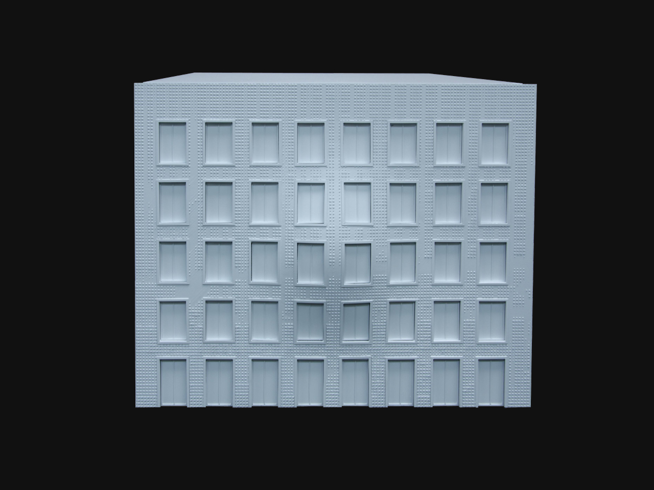
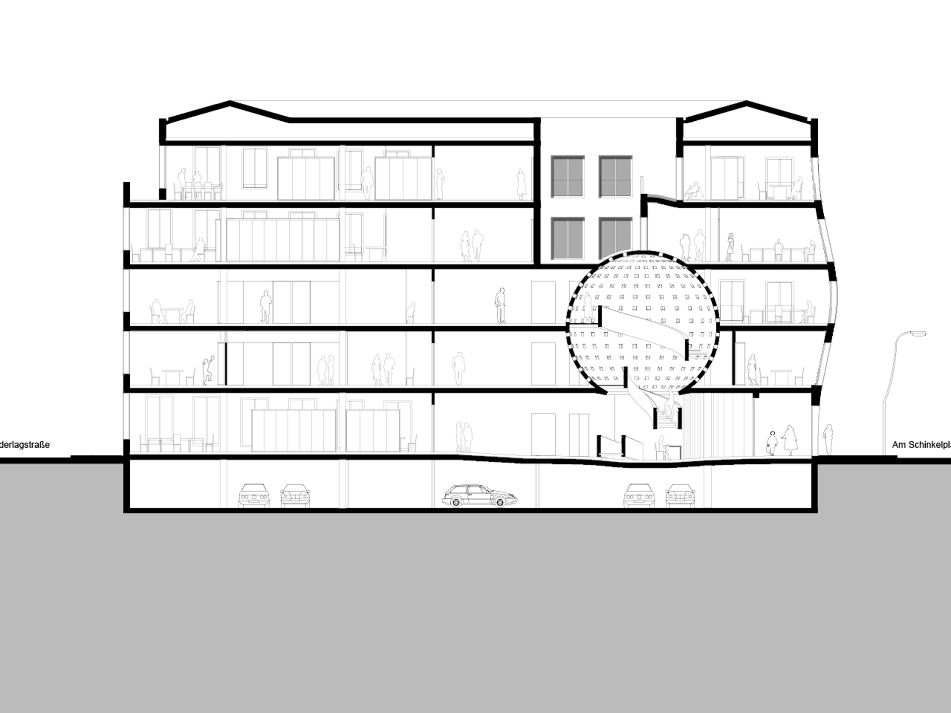
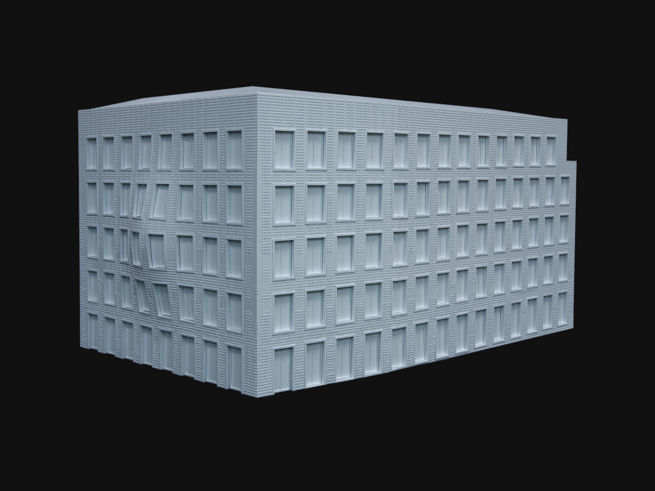
On an empty site in the very centre of Berlin’s most historic district, MVRDV designed a classic office building following the city’s strict aesthetic and zoning guidelines, with a twist. The end-block conforms in almost every way, except for a slight swelling on one of its facades, accentuated by the dot pattern decorating them. The swelling reveals the influence of a spherical internal stair hall, a single small gesture of individuality in a sensitive historic area requiring cohesively polite architecture.
- Location
- Berlin, Germany
- Status
- Design
- Year
- 2012–2012
- Surface
- 7000 m²
- Client
- MVV GmbH & Co. KG
- Programmes
- Offices
- Themes
- Architecture, Transformations
The area around the competition site contains many of Berlin’s most significant historical buildings; the urban layout of an old (better) Berlin will thus be reconstructed. What is the appropriate way to deal with the task of designing new office building in this context? Can we create a building that surpasses this desire for the past? What type of architecture pays tribute to the district with the necessary respect, and yet remains recognizable as a contemporary building that is designed without historical ‘quoting’ or postmodern irony?
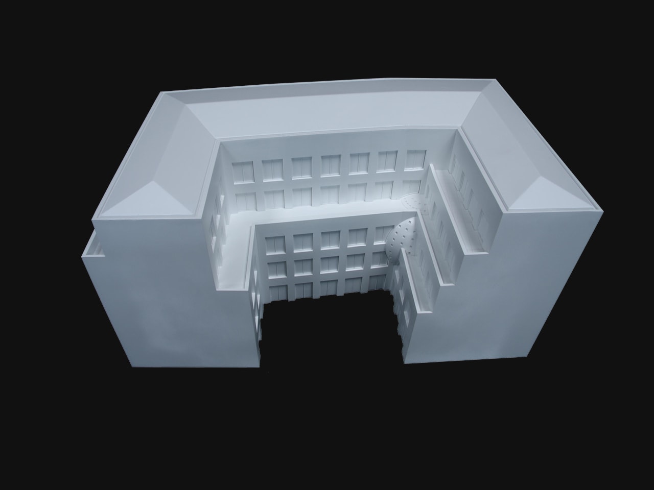
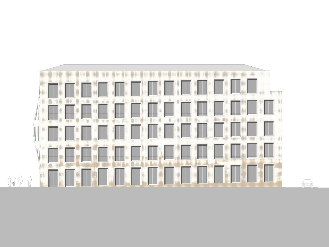
The design for the office building at Schinkelplatz is based on an approach that reflects the surroundings and the history of the site. The new block is fitted precisely into the urban reconstruction of Berlin Mitte and refers to the historical context with an interpretation of the classical city palace. Five conceptual components of the design determine the external appearance, the quality and functionality of the interior spaces of the building. The first, the main entrance of the building faces the square, and leads into a large lobby which is topped by a spherical stair-void. The lobby is connected to the internal courtyard for additional light, and on each floor an entrance hall also faces the garden. The second is that the void of the lobby emerges as a distance echo in the façade facing Schinkelplatz: the centre of the building is highlighted by a gently rounded bay window, which indicates the entrance of the building. This multi-storey bay window is most plastic element of the design, and is intended as a reference to the massive domes of the surrounding environment and a critique of the contemporary tendancy towards non-hierarchical facade subdivision.
Thirdly, the windows of the facades vary slightly according to light and views, sometimes reaching floor or ceiling level while remaining homogeneous in appearance across the façade. Fourth, the facades are lightly decorated with a layer of thin, coloured plaster in the form of dots, which differentiate the classical tripartite division of ground and first floor plinth, middle floors, and top floor. Finally, the courtyard of the building reflects the typological standard of Berlin’s blocks, while being filled with flowering plants which offer contrast to the classically austere building. These five conceptual elements ground the building in its context, while forming a thesis for a contemporary take on the architecture of Berlin.
Gallery
.jpg?width=1920)
Credits
- Architect
- Principal in charge
- Design team
- Strategy & Development