Grüne Mitte
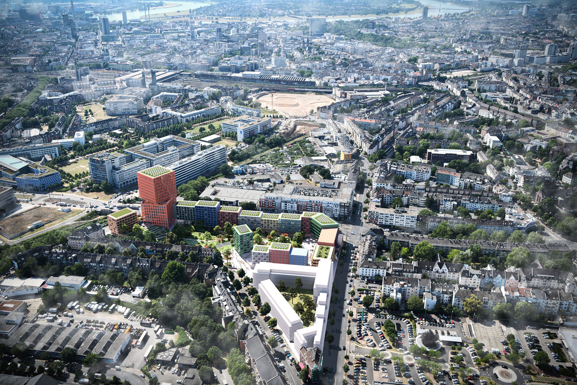
The process of building within an existing neighbourhood is often fraught with conflict. In too many development projects, the local community has a stark choice: accept proposals presented by developers and the municipality, or fight the development outright. But in Düsseldorf, the Grüne Mitte project has shown how far a development can go using an approach based around open communication, negotiation, and compromise. The urban design project proposes almost 500 new apartments – approximately 50 per cent of which will be social or affordable housing – and community spaces to uplift the neighbourhood, while meeting the expectations of the city and their client.
- Location
- Düsseldorf, Germany
- Status
- In progress
- Year
- 2021–
- Surface
- 60000 m²
- Client
- Cube Real Estate GmbH
- Programmes
- Mixed use, Offices, Retail, Residential, Sports, Master plan
- Themes
- Architecture, Housing, Mixed use, Urbanism
The site sits alongside a busy road in Flingern-Süd, which is currently occupied by an underutilised shopping centre, supermarket, and car park complex that was built just 11 years ago. It also borders Kiefernstraße, a street which is famous for being a hotspot for squatters since the 1980s and for the colourful street art on the facades. With this idealistic and politically organised community next door, any proposal to significantly develop the site requires the involvement and broad support of its direct neighbours and the diverse community of Flingern-Süd.
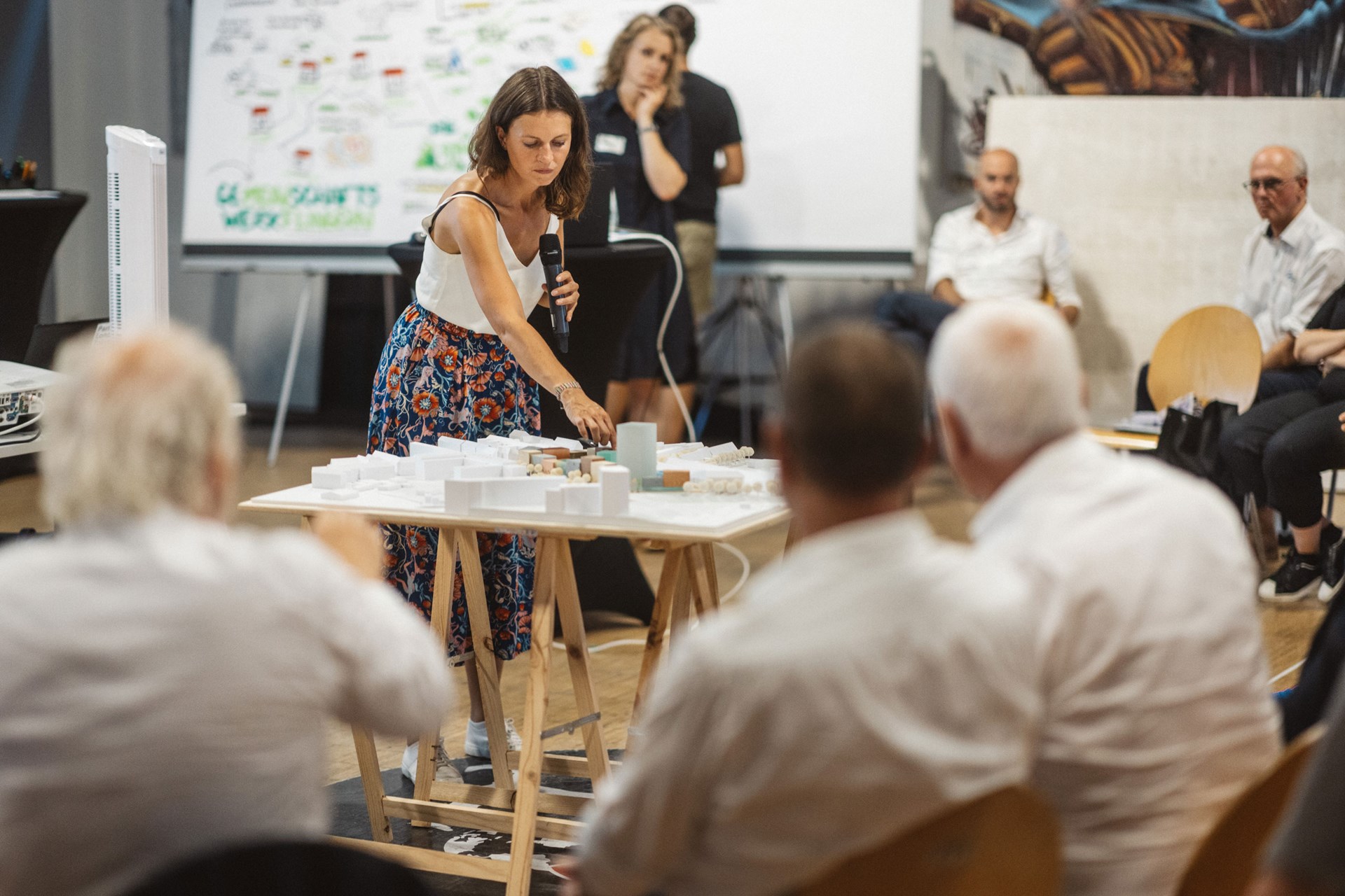
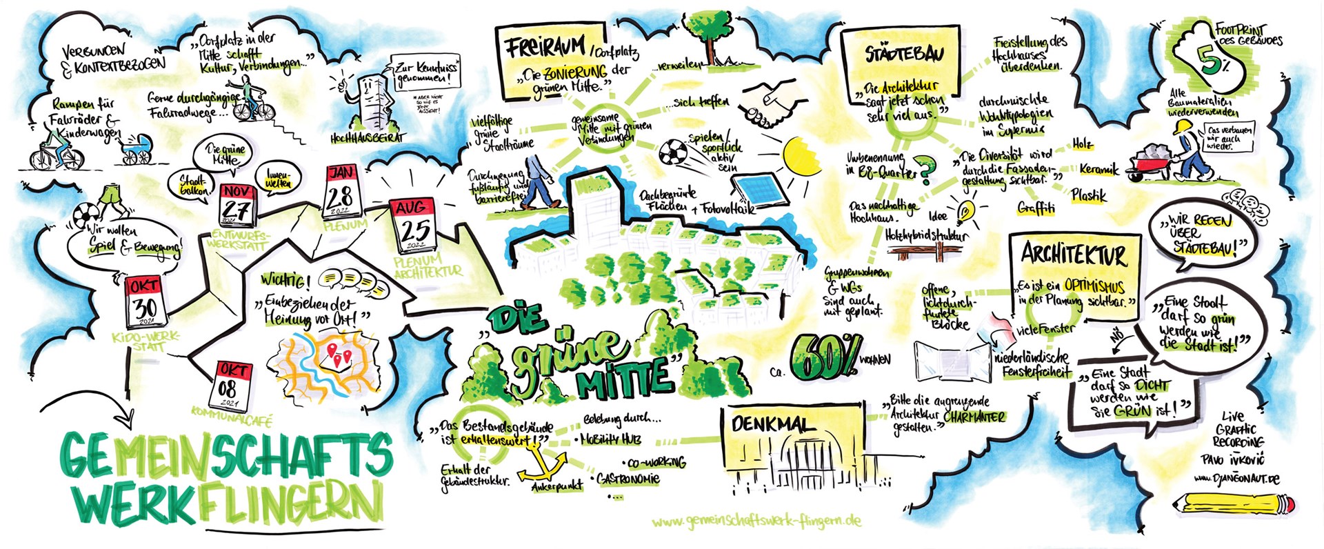
This set the stage for an intensive participation process to marry the ideas of the developer with the desires of the local residents and the ambitions of the city planning office. In a series of workshops conducted by MVRDV and LOLA, residents were interviewed and helped to brainstorm the development; walks around the area took place, with slogans and markers sprayed onto the ground to visualise ideas; a separate workshop with local children identified additions that would benefit young people; and in an online conference, the design team modelled people’s suggestions in real-time.
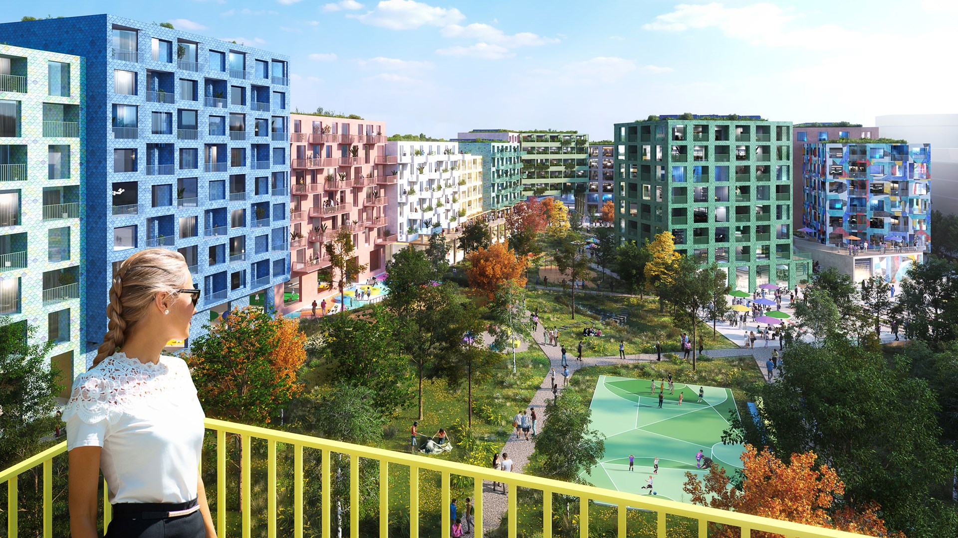
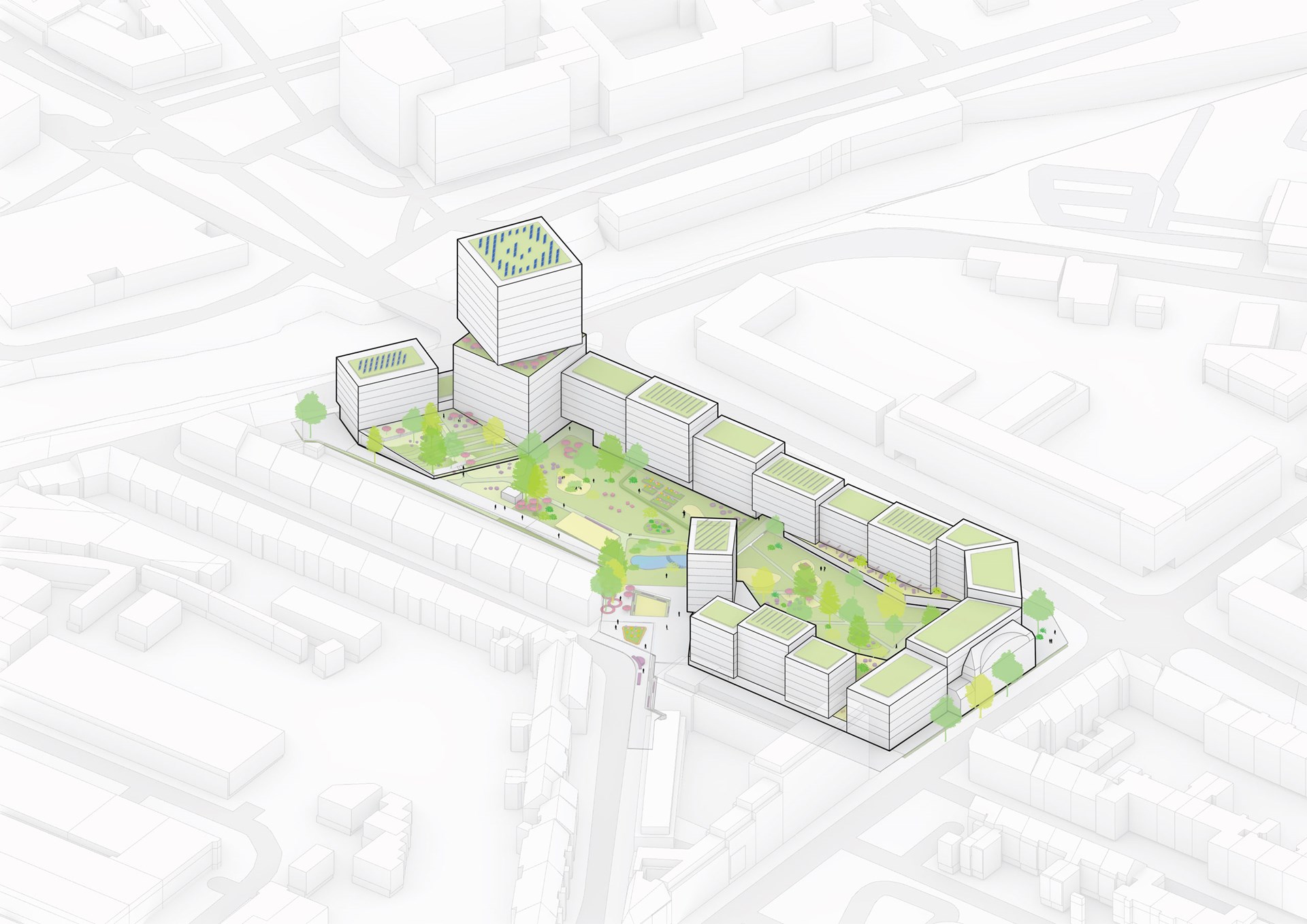
Among the requirements that emerged from this process were the need to keep the supermarket at this location as an important social meeting spot, the desire to better connect the area to neighbouring city districts, and to incorporate public spaces which help the new development serve as an inclusive social environment. During the process, the designers created three outline proposals for residents to discuss the benefits and drawbacks of each design approach. The most popular design was the “Grüne Mitte”, with a series of blocks that snakes around a central collective green space.
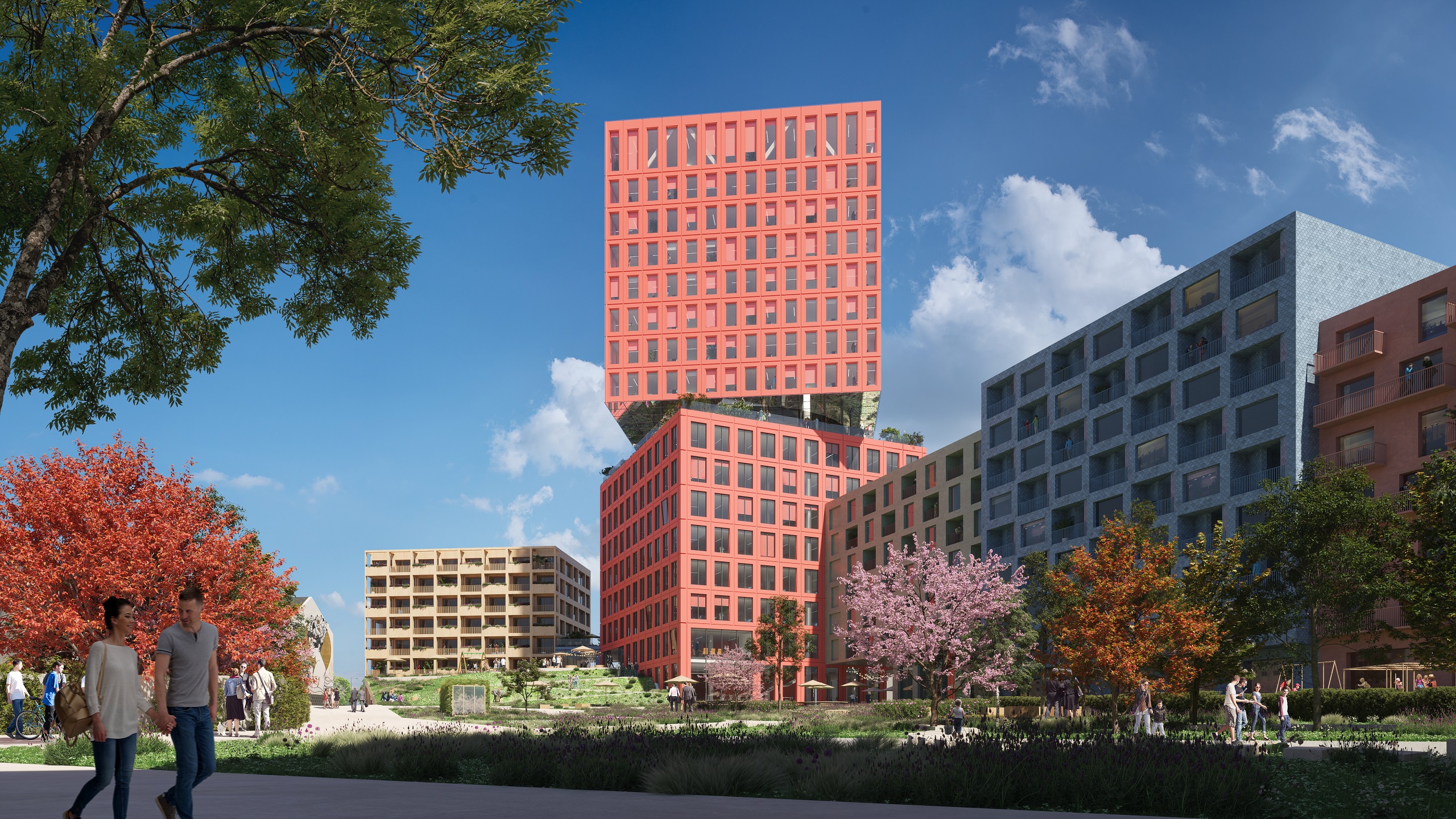
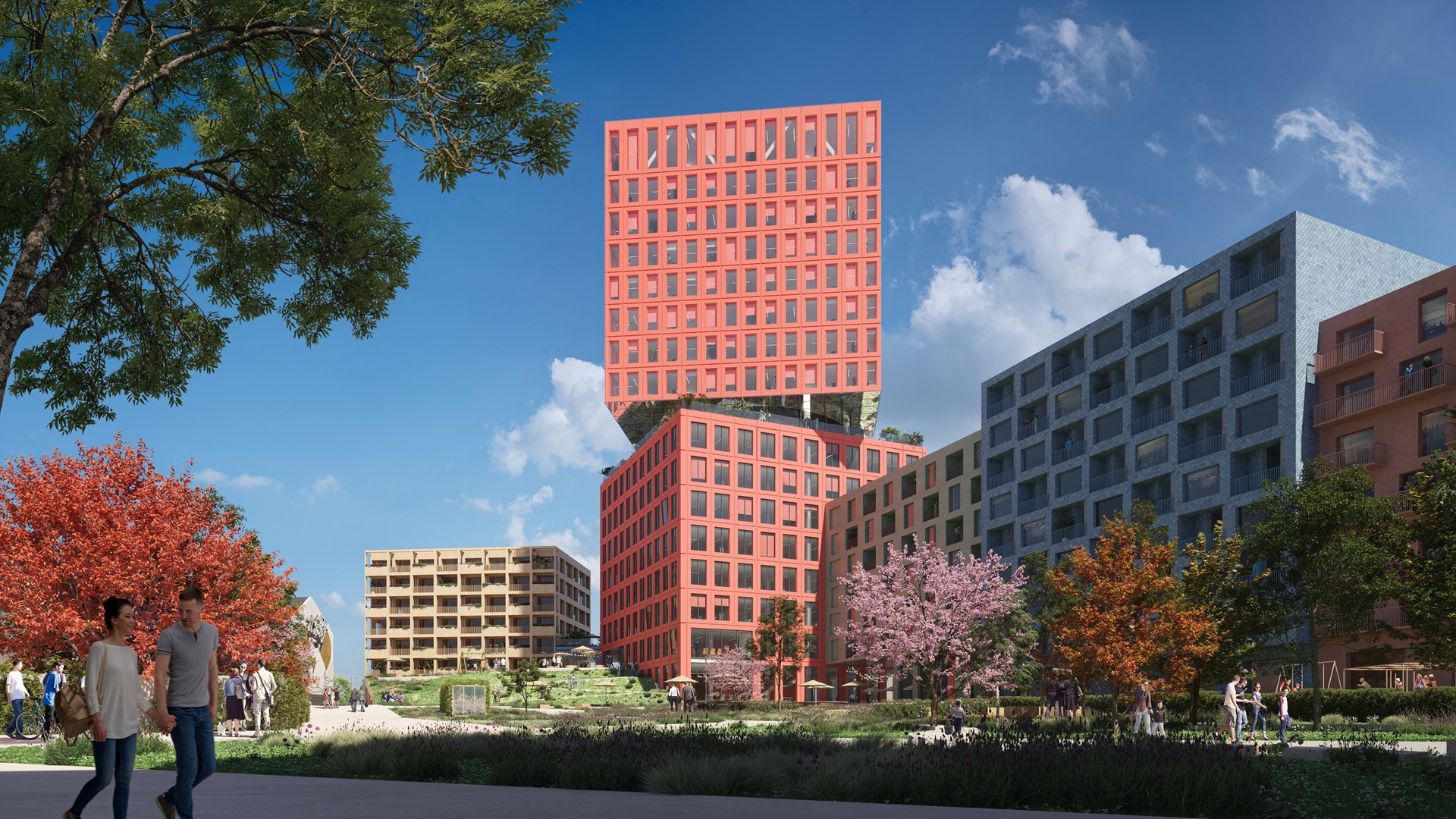
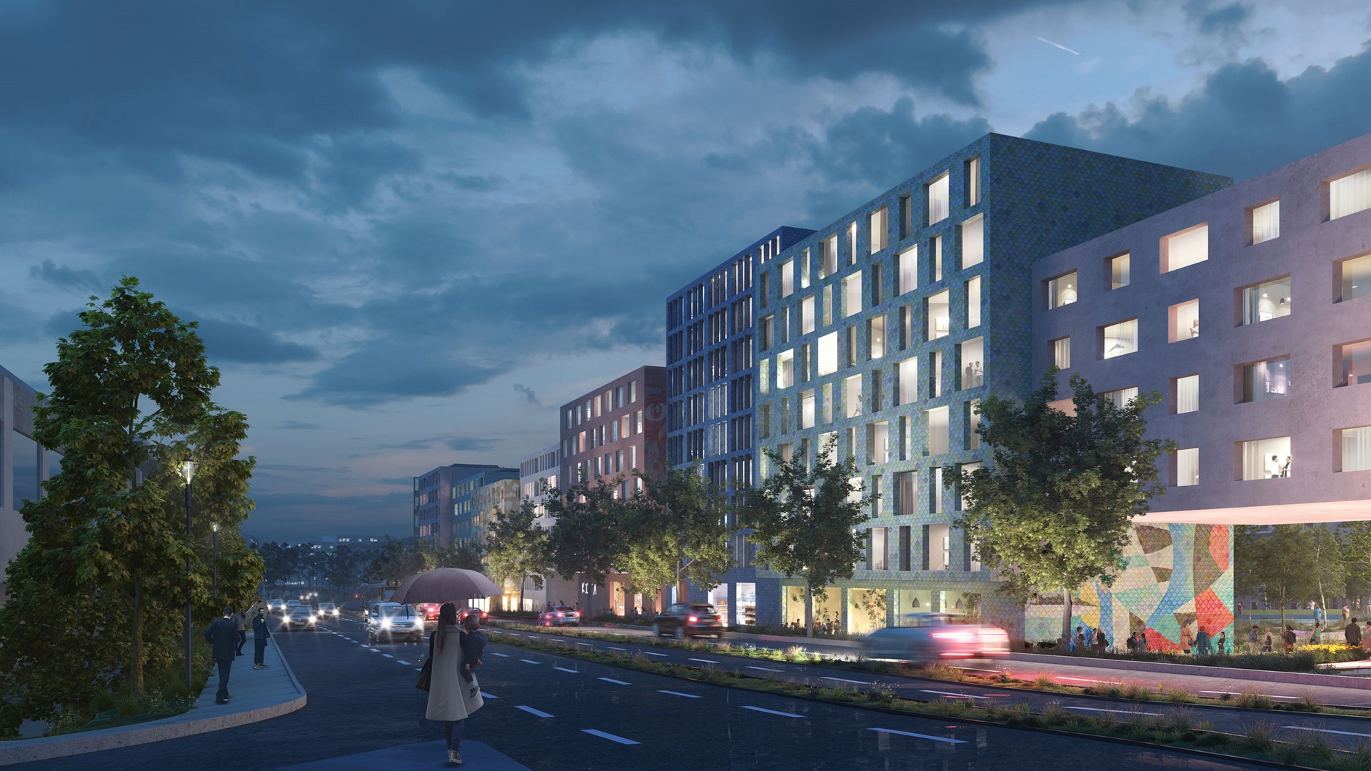
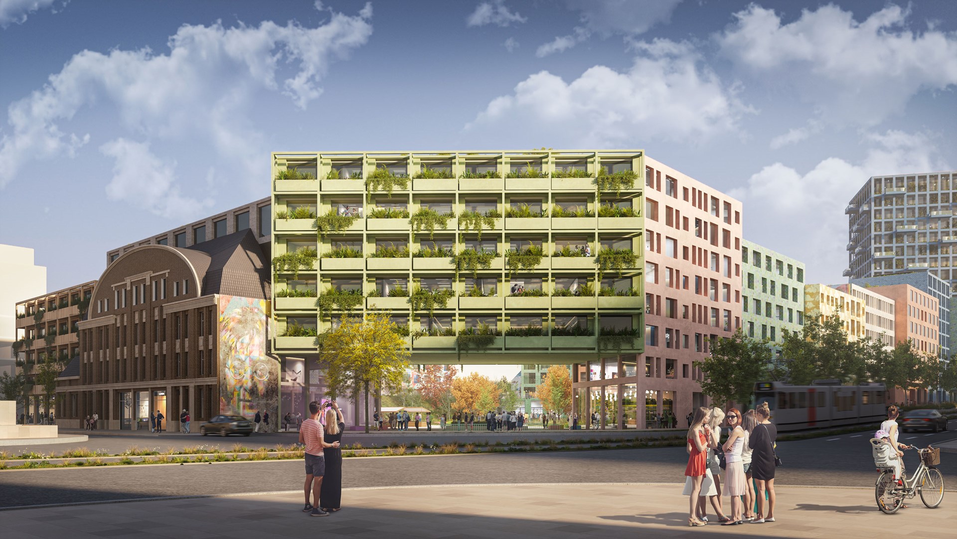
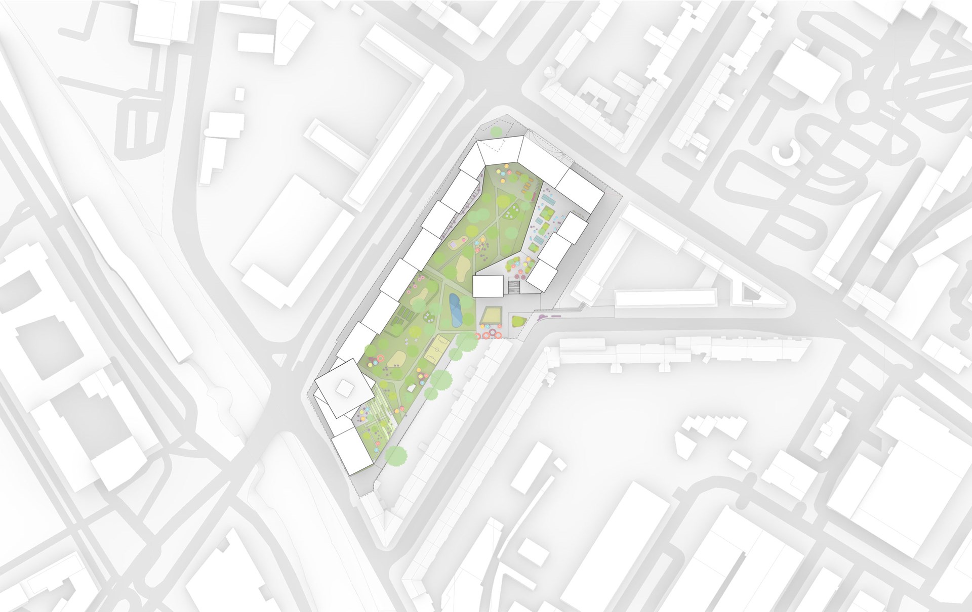
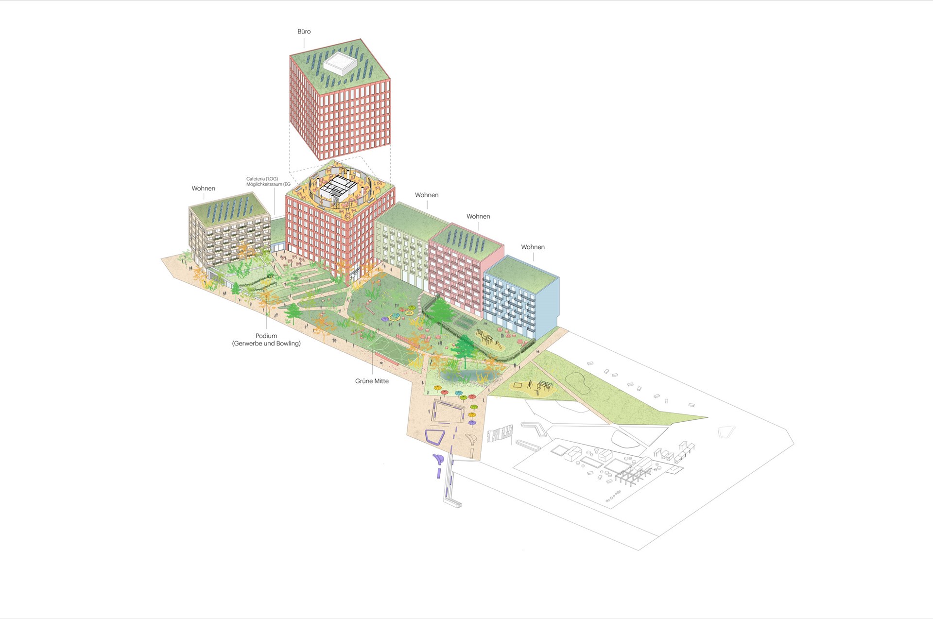
The park-like space at the heart of this block decreases the amount of paved or built surface from 98 percent of the site to 62 per cent, and forms a central space for the community. It can be entered from the corner of Kiefernstraße, and via three passages through the building on the side of the main road that connect the development to its neighbourhood. In addition to greenery, it hosts a catalogue of amenities, from kiosks to sports facilities and playgrounds. The green open space contributes to increasing the biodiversity in the neighbourhood and creates a pleasant microclimate, especially on hot summer days. To make this large green space economically possible required a bold spatial compromise, which was solved with an office high-rise on the south-western corner of the site. Understanding the benefits of this trade-off, the community strongly supported the addition of this tower and, while a tower on this location was not in the city’s high-rise plan, the local support of the design served as a strong incentive for the city’s high-rise committee to give special approval.
This led to a further community consultation process to design the high-rise itself. Just as in the overall masterplan, the design team produced three proposals to start a discussion about the benefits and drawbacks of different approaches. The best elements of these proposals were eventually combined into a 17-storey design comprising two stacked blocks – the lower one aligned with the neighbouring blocks that make up the Grüne Mitte, while the upper block is twisted to better align with the prominent streets and features of the neighbourhood. An intermediate floor in between provides a dedicated space for the offices’ breakout spaces, meeting rooms, and other amenities.
The desires of the community helped to define a wide range of design features. Among these are the project’s sustainability approach, which includes green roofs with photovoltaic panels, cross-laminated timber floors in the office tower, and an urban mining approach that will see components from the existing shopping centre reused as much as possible. It also includes a focus on celebrating the qualities of the community: each of the blocks that constitute the overall building are proposed to receive a different façade treatment, showing the diversity of future users and making the building less imposing. Some of these walls are proposed to be covered in street art developed with the residents of Kiefernstraße, echoing the murals that have become a signature of the street’s appearance.
“With the pandemic, a part of the participation process happened online, which was a blessing in disguise. We saw active participation from the attendees, with many adding comments in the chat, and excellent moderation”, says MVRDV founding partner Jacob van Rijs. “These online meetings allowed us to do an architectural version of ‘live-cooking’, where requests from the audience were tested on the spot using quick models. Besides offering a fun way to develop the project, it sped up the design process and increased the community’s involvement. The result was a clear choice for more greenery in the neighbourhood, which was combined with the understanding that a taller volume would therefore also be needed.”
Gallery

Credits
- Architect
- Founding partner in charge
- Director
- Design team
- Bplan design catalogues:
- Diana Betty Dragan
- Andrea Bit
- Winona Hoic
- Yannic Schroeder
- Phase One Revised:
- Johannes Pilz
- Bartosz Kobylakiewicz
- Alex Niemantsverdriet
- Partners
- Landscape architect:
- LOLA Landscape Architects
- Bplan Architects:
- MVRDV
- Henning Shin Architekten
- BM+P Architekten
- konrath und wennemar
- Project coordination:
- Ulrich Hartung GmbH
- Structural Engineer:
- Bollinger Grohmann
- Model:
- Made by Mistake
.jpg?width=900&quality=75)