Studio Thonik
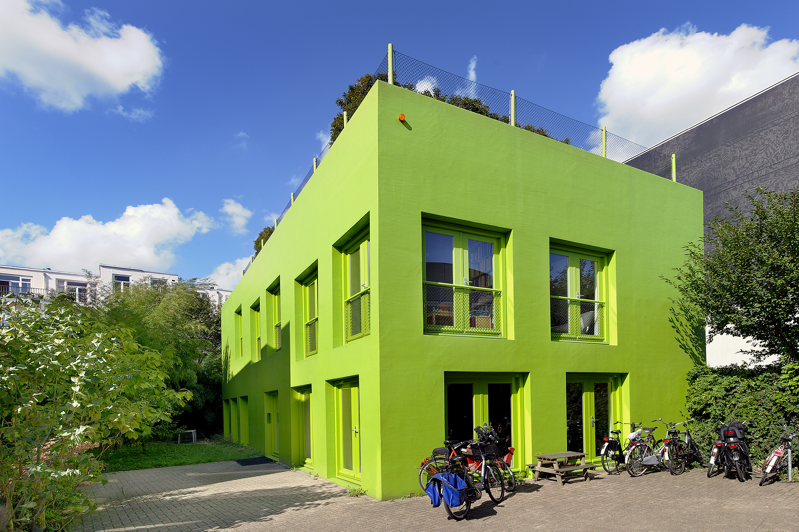
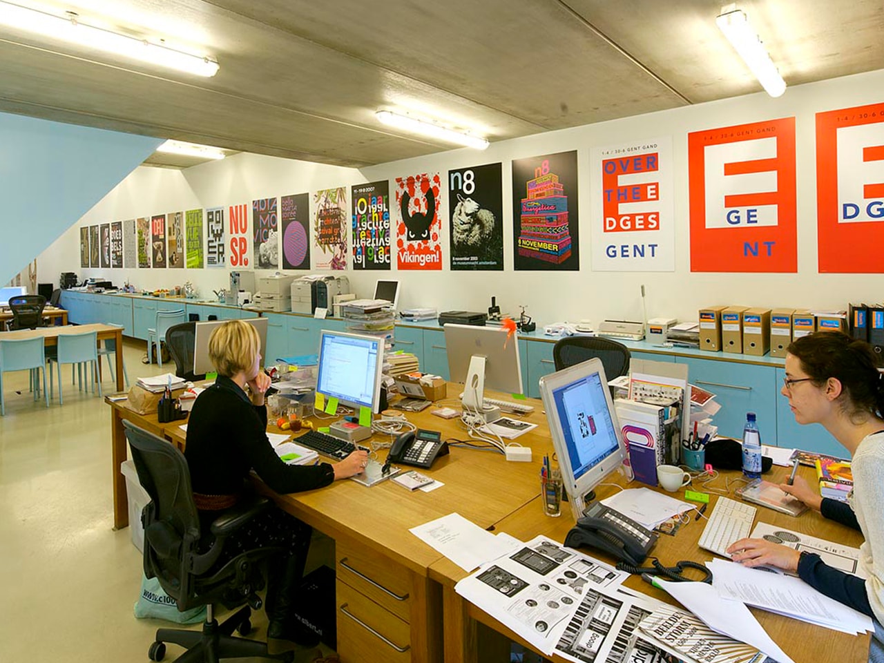
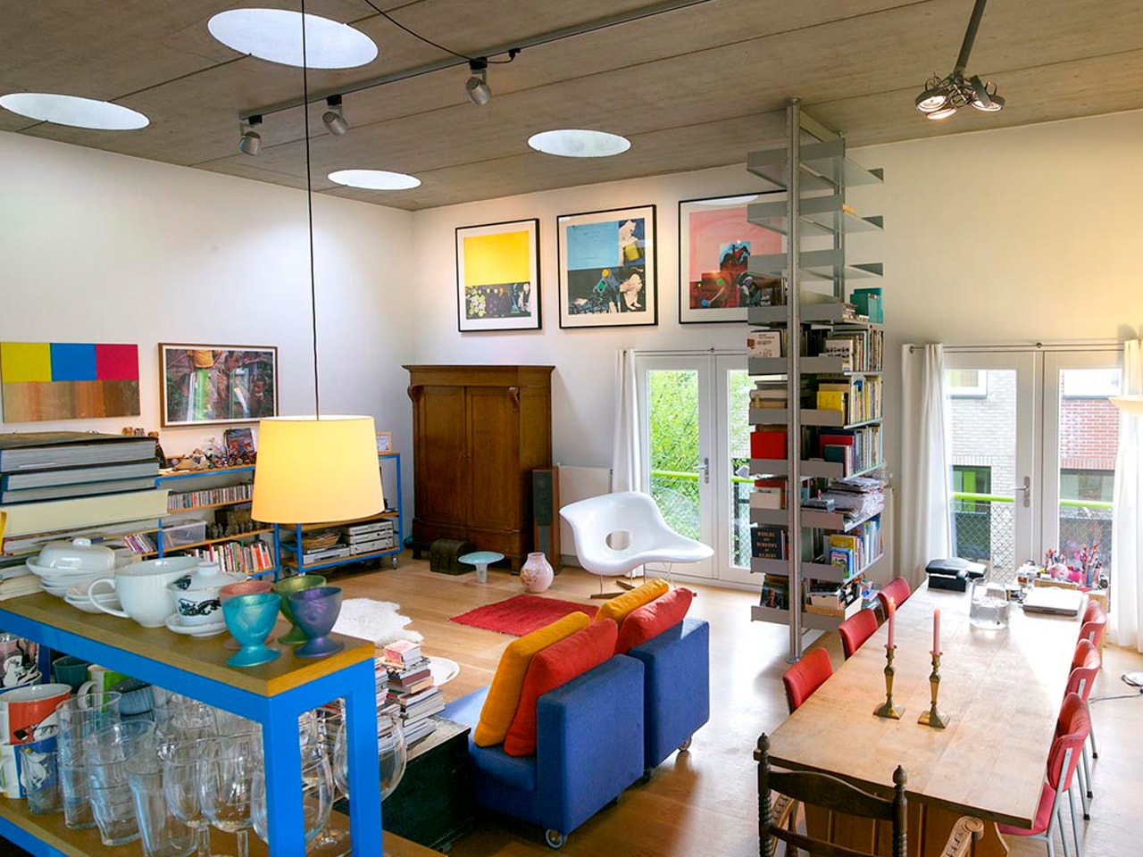
In the hidden inner court of an Amsterdam Block in the east of the city, the client, owners of the renowned graphic design firm Thonik, desired a house, both for living and working, but the municipality only allowed them an office.
- Location
- Amsterdam, Netherlands
- Status
- Realised
- Year
- 1998–2001
- Surface
- 288 m²
- Client
- Thonik, Amsterdam, NL
- Programmes
- Offices
- Themes
- Architecture
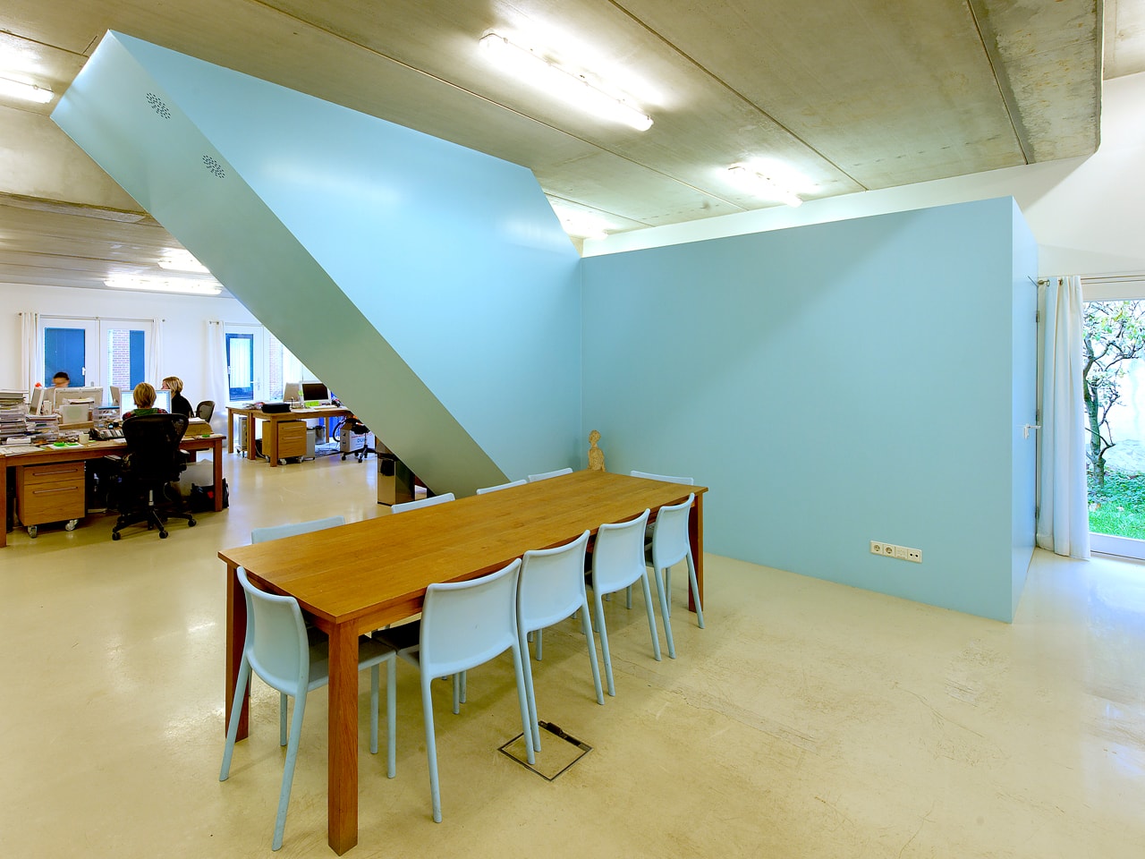
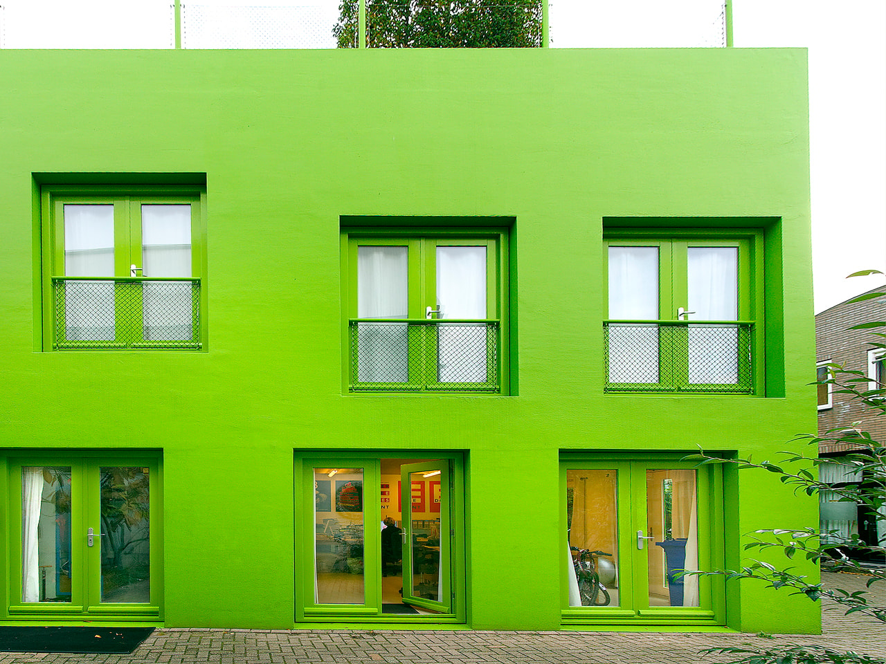
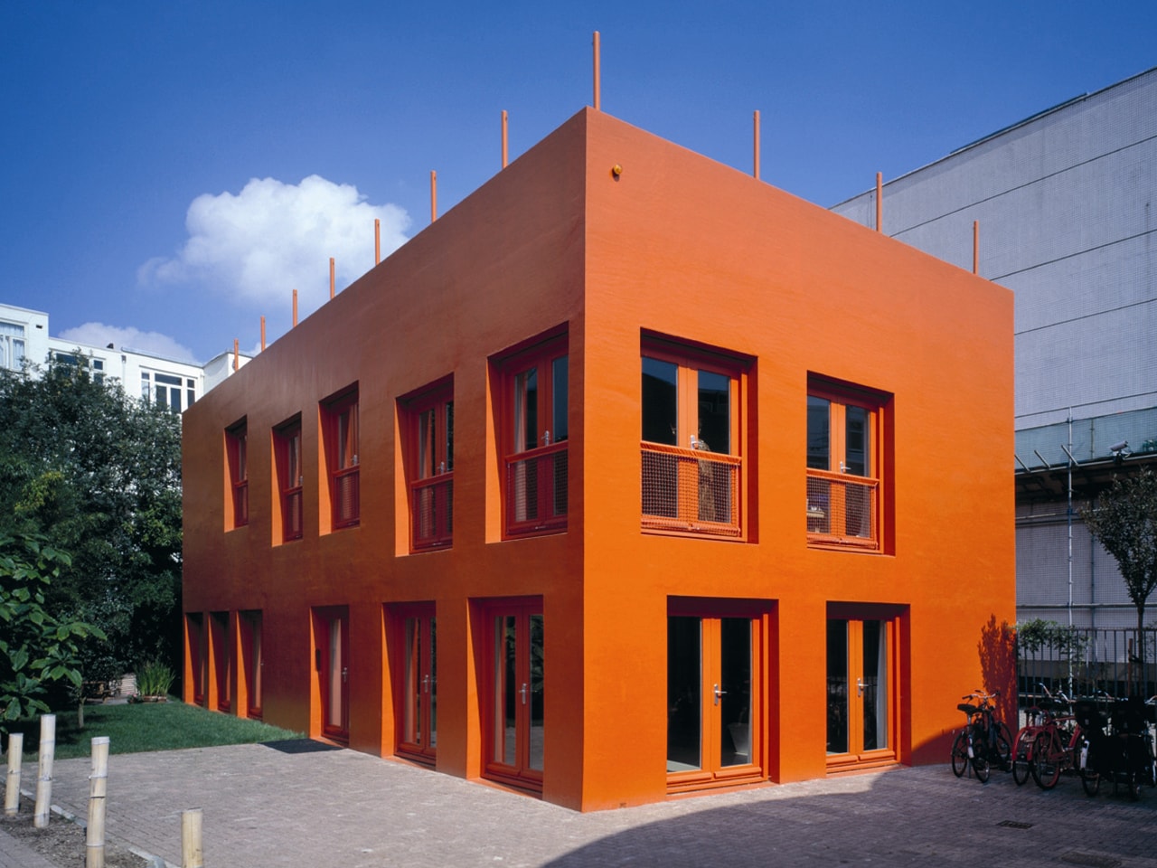
The design itself is radical in its simplicity: a simple shoe-box with two floors, as simple as possible, except that the first floor was not flat but a sequence of large steps. This resulted in a ground floor with increasing ceiling heights towards the garden, and a first floor stepping up towards the roof deck. In order to also keep the execution as simple as possible, lightweight stone block was selected as the main building material, with the lightweight blocks serving as insulation and structure at the same time.
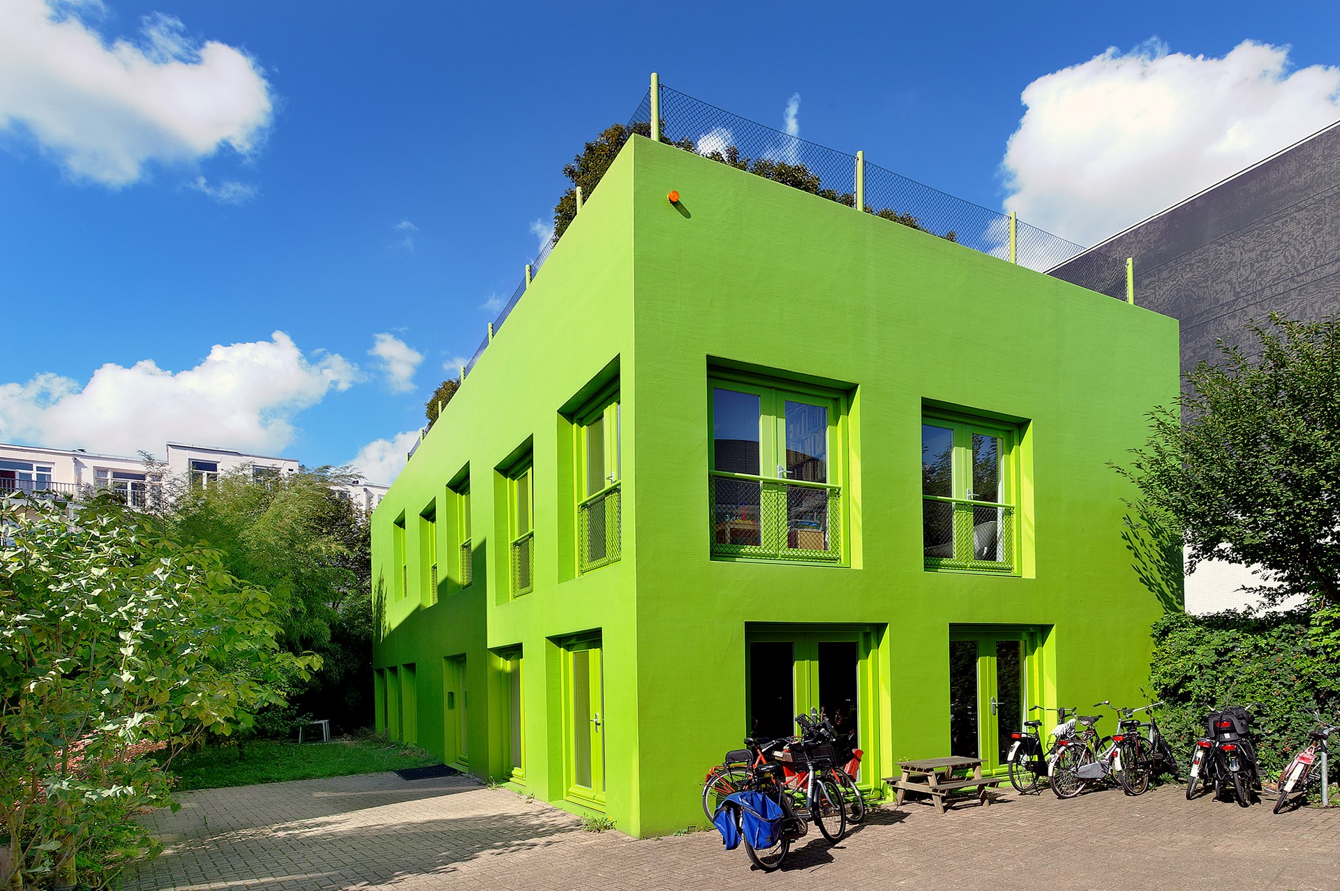
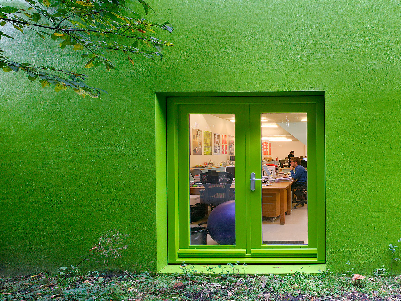
A polyurethane coating in a single bright colour was added for the walls, floors, fences, mailbox, ping pong table, benches, and pool makes it stand out in the area, which was at the time dominated by grey uninspiring blocks. The polyurethane coating could be applied in any colour, and to avoid a delicate discussion on colours and tastes, MVRDV left the choice of colour to Thonik. Bright orange would offer a warm touch in the courtyard combining red brick and terracotta with the clean look of Thonik’s graphic language.
Immediately it grabbed attention: Although the orange was officially approved by the municipality (not to mention that it is the national colour of the Netherlands), the orange was for some neighbours too orange. They started to complain about the brightness causing ‘unlivable’ circumstances. This led to a public debate on whether this colour was aggressive or just cheerful.
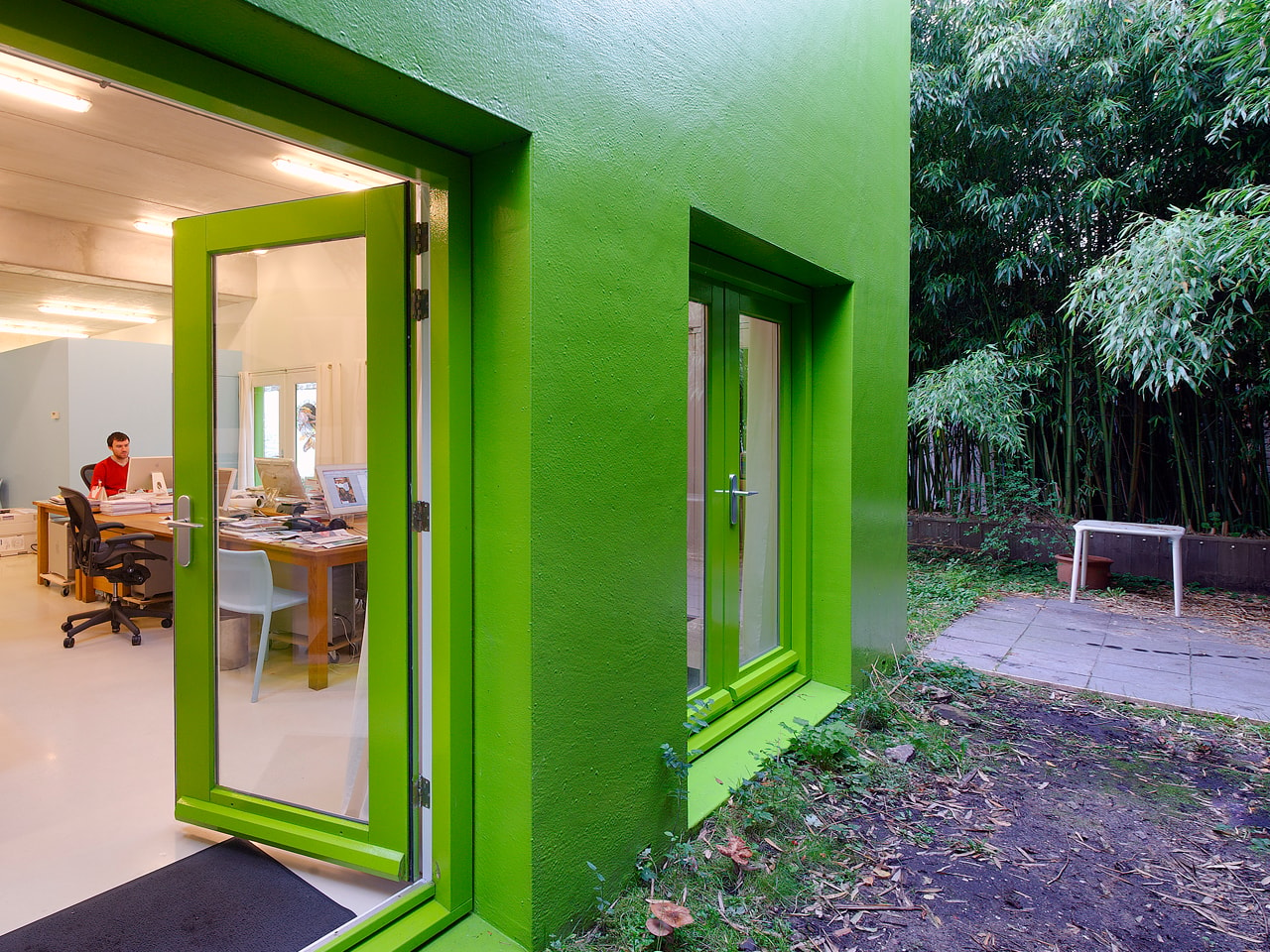
In exchange for a new colour, the city accepted a change in the function of the building from office to residential and office, and a mediator assisted in the selection of a new colour. The orange polyurethane coating was changed to apple green, a classic but nice compromise, not orange but still bright
Gallery
.jpg)
Credits
- Architect
- Principal in charge
- Design team
